HEADS UP - All physical product shipping is on hold until mid-June!
Log in
Cart (
0
)
Checkout
Home
About
My Book
Shop
PDF Patterns
Printed Patterns
Book
Kits & Bundles
Quilt Kits
Fabric Bundles
Notions & Gifts
Handmade Quilts
Fabric Destash
Blog
Scrap Management
Tutorials
Wholesale
Contact
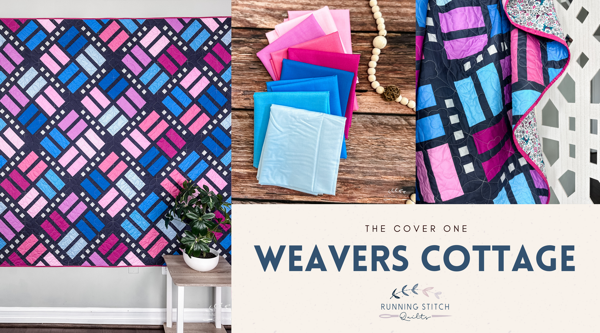
Weavers Cottage
advice
Deltille
Desert Charm
michael miller
Mod Tops
Weavers Cottage
April 2024 Color Inspiration
cover quilt
michael miller
quilt pattern
solids
Weavers Cottage
Weavers Cottage - The Cover One