HEADS UP - All physical product shipping is on hold until mid-June!


Welcome to the the Running Stitch Quilts Color Inspiration blog series! In this new series, I'll be diving into the world of color and bringing you practical color palettes. Every month, I'll pick a set of 3 or 4 foundational colors to use in building out fun and expressive color palettes that you can apply to my quilt patterns or any future quilts. Keeping reading for some quilty inspiration!
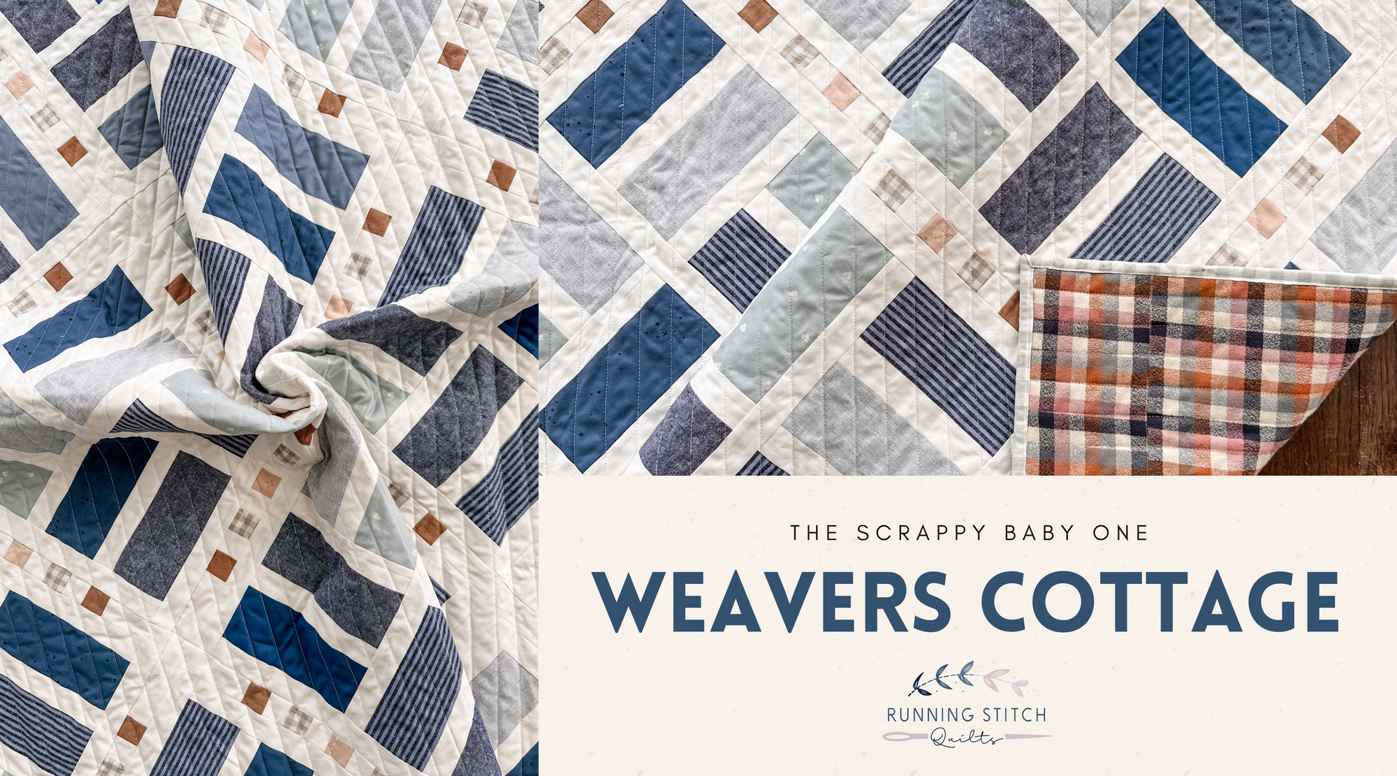
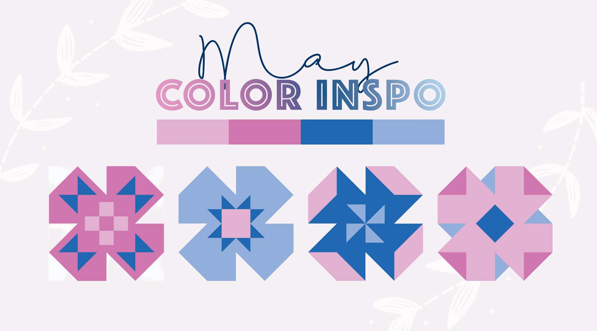
My May color inspiration came from the cover quilt colors of my May Pattern of the Month - Weavers Cottage. (In case you missed it, all Pattern of the Month items are on sale through the end of May!)
The colors of my Weavers Cottage cover quilt are all from the Michael Miller Cotton Couture collection. If you've been around here for a little bit, you'll know that I absolutely love using Cotton Couture fabrics! I talked all about this cover quilt on my blog if you want to read more about it.


These deep jewel tones have been so inspiring recently. And in the spirit of Weavers Cottage being the Pattern of the Month, I wanted to expand upon these four colors (Blue, Boy, Peony, and Rose) and show you how you can turn them into three different full and dynamic color palettes!


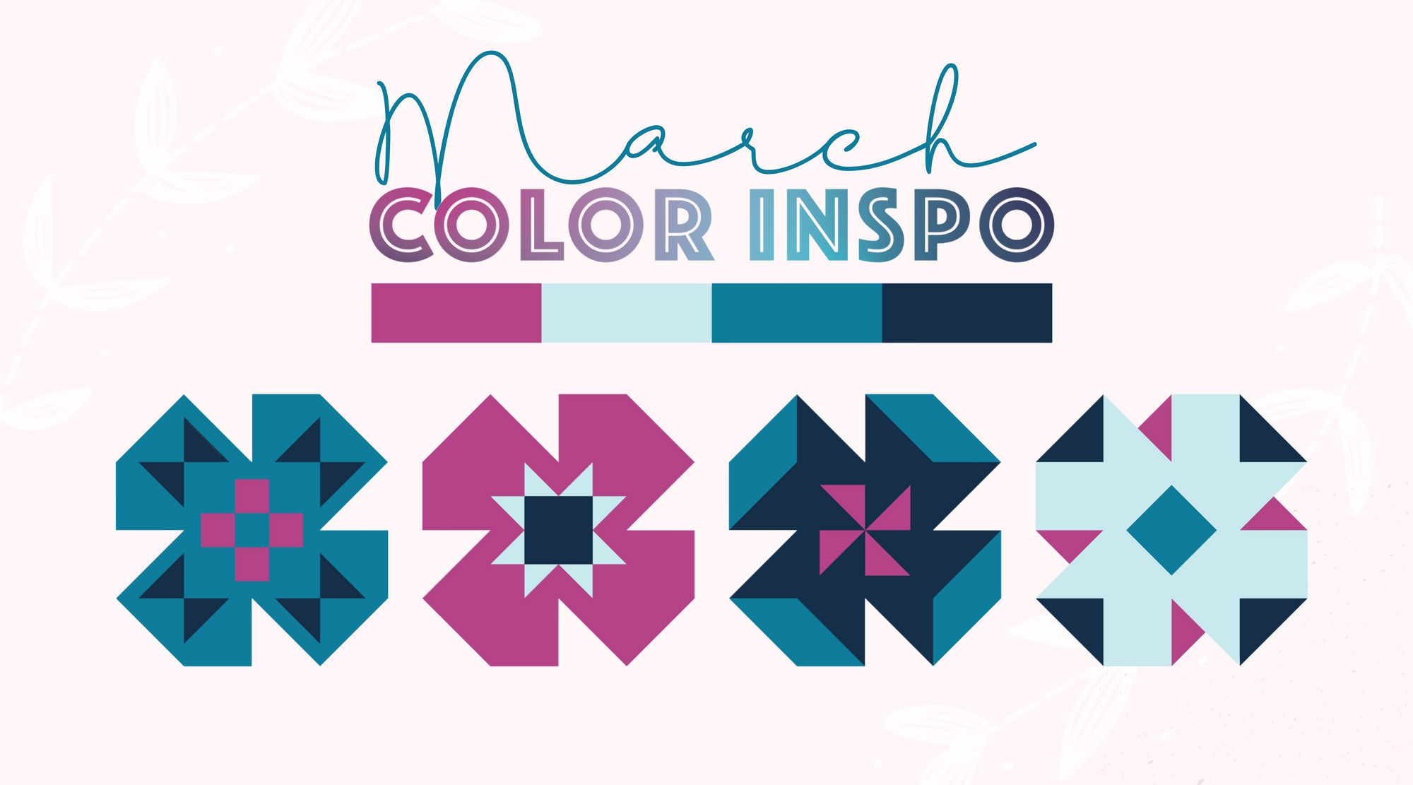
For the first color palette, I wanted to squeeze in as many colors as I could to achieve a nice pink to blue gradient. If you've noticed my past color inspiration blogs, you'll see that I kind of love working with color gradients. So you'll probably be seeing a lot more in the future too!
This color palette has a well-balanced feel to it with the deep colors like Royal, Midnight, and Jewel and the lighter colors like Breeze, Flower, and Blossom included. You can see in both Weavers Cottage and Mod Top (quilt pattern coming soon!) that the distribution of these colors plays well with each other in this scattered form and in the true gradient shown above!


In this next color palette, I added purples and teals into the mix to give it an ocean-y, mermaid vibe that my daughter would LOVE. This color palette still has some deeper colors like Sweet Lily and Lagoon in it, but overall, it feels a lot lighter and breezier. This palette does a great job of lending itself to a scrappy feel like in the Weavers Cottage and Square Burst quilt pattern mock-ups below.


In the final color palette, I added in various shades of purple that really gives it a true jewel tone look! Having Opal and Lilac included here brings in the pink side of this palette while the Grape and Hyacinth brings in the blue side. These deeper colors pop again the white background in the Weavers Cottage and Autumn Garden quilt pattern mock-ups below!


Playing with color is one of my absolute favorite things to do! Being able to blend colors together to create such dynamic color palettes for my handmade quilts makes my creative soul so happy. I invite you to try out one of my May Color Inspiration color palettes in your next quilt! Whether you use the exact fabrics or use them as a jumping-off point for your own palette, I'd love to see! Share your quilts made with my color palettes on Instagram using the hashtag #RSQColorInspo or tag me in your photo. :)
Stay tuned for next month's Color Inspiration. Until then, happy sewing!