All Printed Patterns Are Now BACK IN STOCK!
Log in
Cart (
0
)
Checkout
Home
About
My Book
Shop
PDF Patterns
Printed Patterns
Book
Kits & Bundles
Quilt Kits
Fabric Bundles
Notions & Gifts
Handmade Quilts
Fabric Destash
Blog
Scrap Management
Tutorials
Color Inspo
Wholesale
Contact
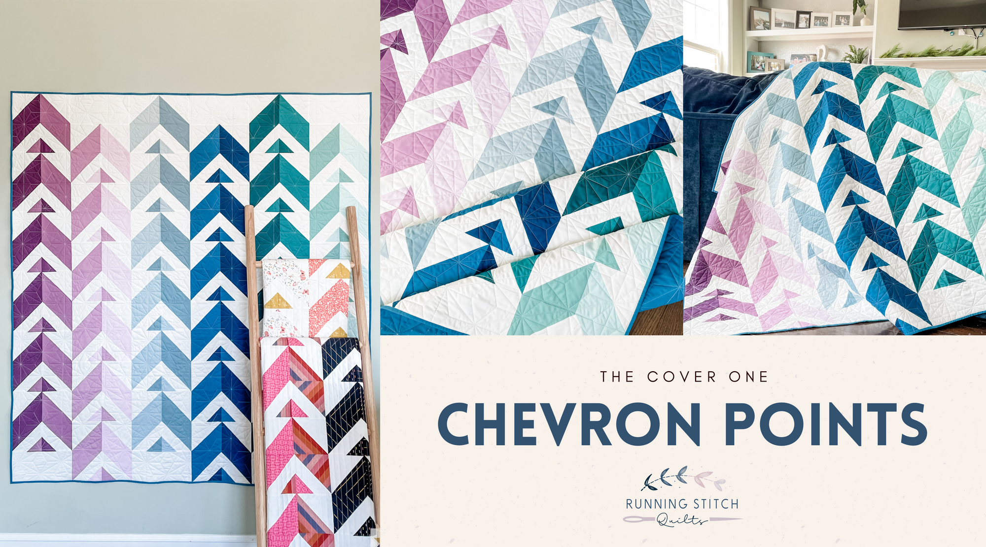
Chevron Points
advice
Chevron Points
color inspo
Deltille
Hurrication
michael miller
Spring Garden Quilt
March 2024 Color Inspiration
Chevron Points
quilt pattern
ruby star society
Chevron Points - The Warp and Weft Honey One
Chevron Points
quilt pattern
riley blake designs
Chevron Points Quilt - The Daybreak One
Chevron Points
cover quilt
quilt pattern
solids
Chevron Points - The Cover Quilt
baby
Chevron Points
michael miller
quilt pattern
Chevron Points - The Baby One