Log in
Cart (
0
)
Checkout
HOME
IMPROV
SHOP
PDF Patterns
Printed Patterns
Book
Kits & Bundles
Quilt Kits
Fabric Bundles
Notions & Gifts
Handmade Quilts
Fabric Destash
BLOG
Scrap Management
Tutorials
Color Inspo
ABOUT
WHOLESALE
CONTACT
LOGIN
HOME
IMPROV
SHOP
PDF Patterns
Printed Patterns
Book
Kits & Bundles
Quilt Kits
Fabric Bundles
Notions & Gifts
Handmade Quilts
Fabric Destash
BLOG
Scrap Management
Tutorials
Color Inspo
ABOUT
WHOLESALE
CONTACT
LOGIN
color inspo
Home
Blog
September 2024 Color Inspiration
July 2024 Color Inspiration
June 2024 Color Inspiration
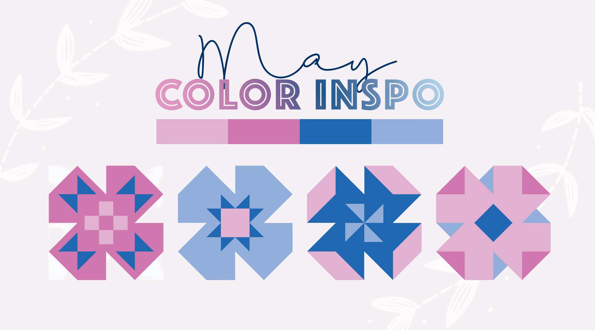
May 2024 Color Inspiration
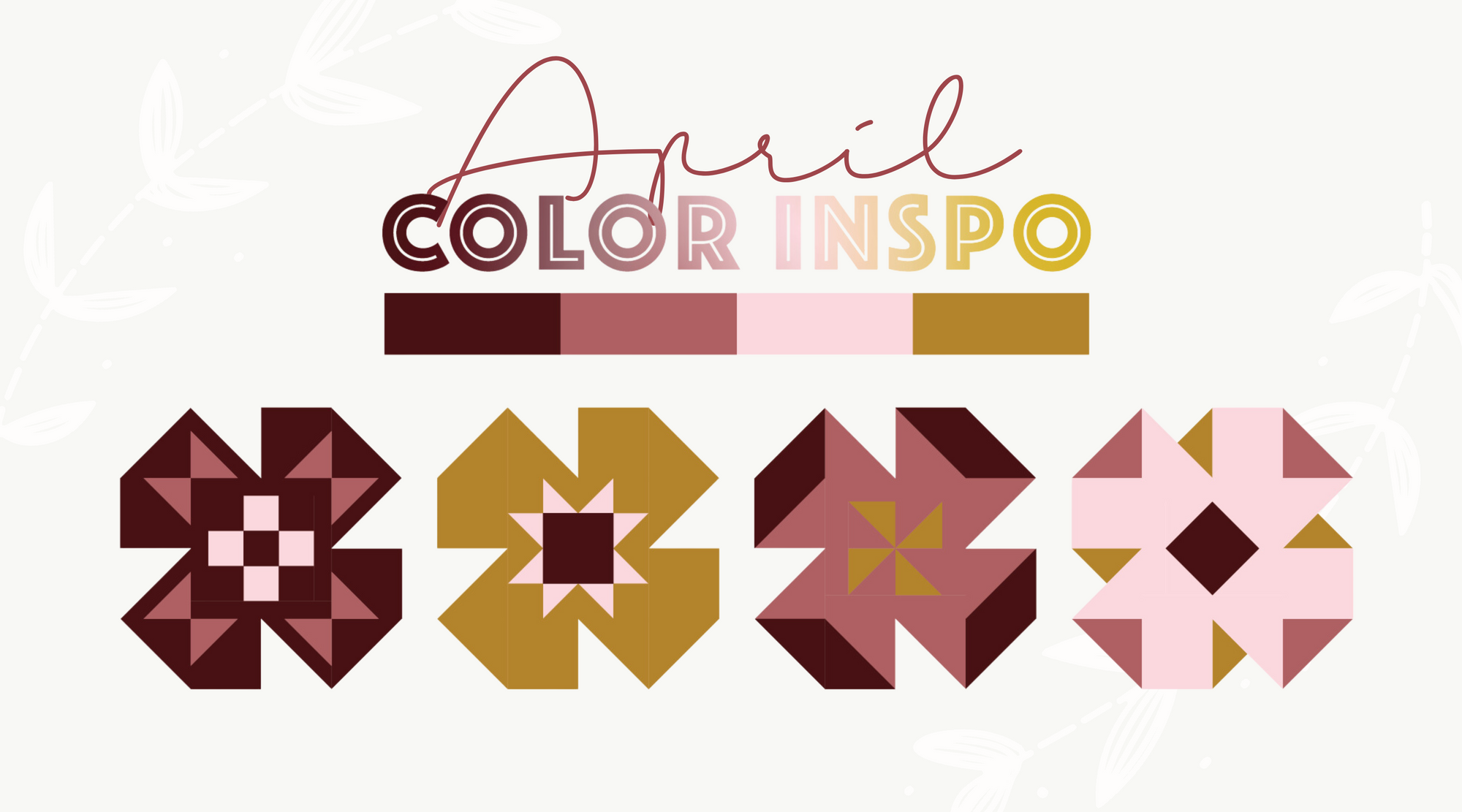
April 2024 Color Inspiration
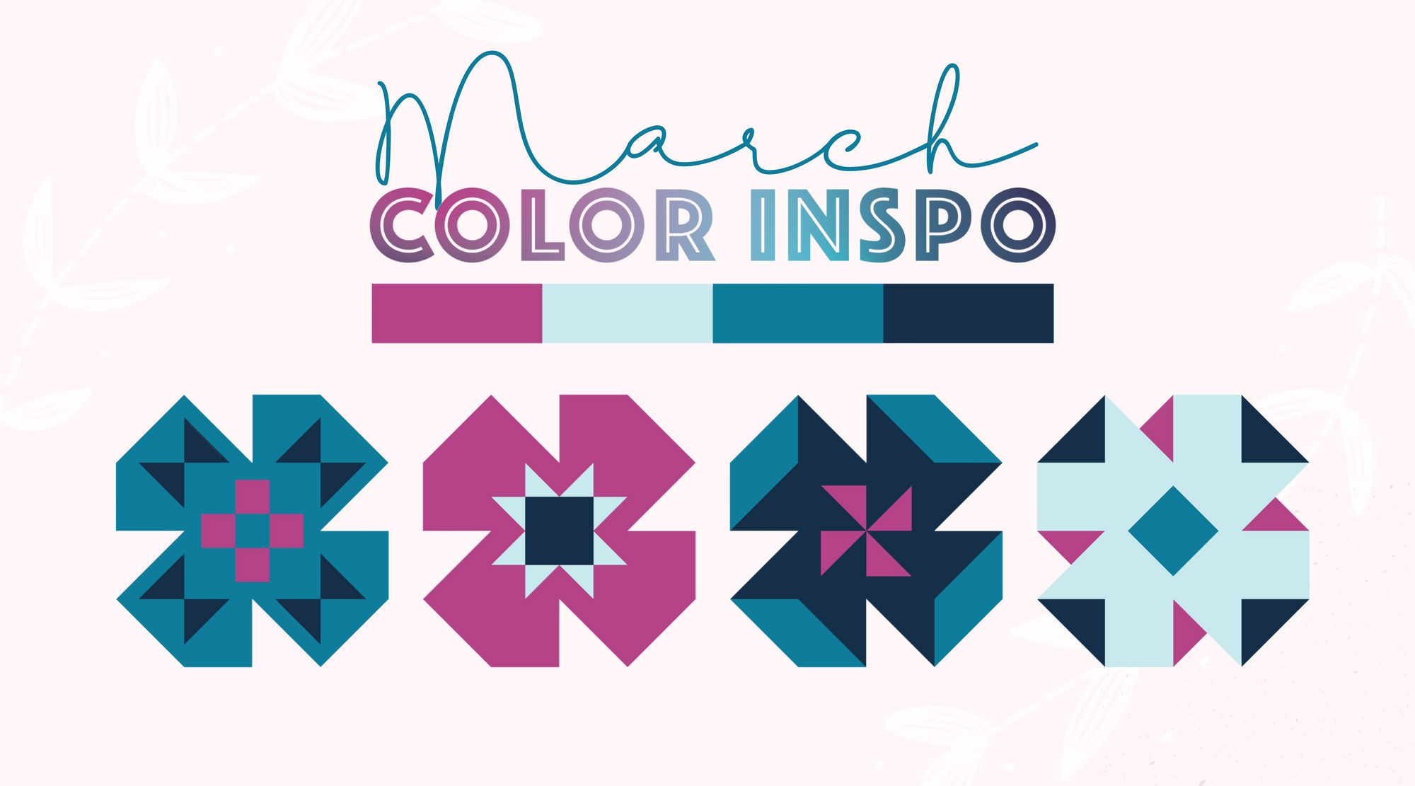
March 2024 Color Inspiration
Search