All Printed Patterns Are Now BACK IN STOCK!
Log in
Cart (
0
)
Checkout
Home
About
My Book
Shop
PDF Patterns
Printed Patterns
Book
Kits & Bundles
Quilt Kits
Fabric Bundles
Notions & Gifts
Handmade Quilts
Fabric Destash
Blog
Scrap Management
Tutorials
Color Inspo
Wholesale
Contact
quilt pattern
quilt pattern
scrappy
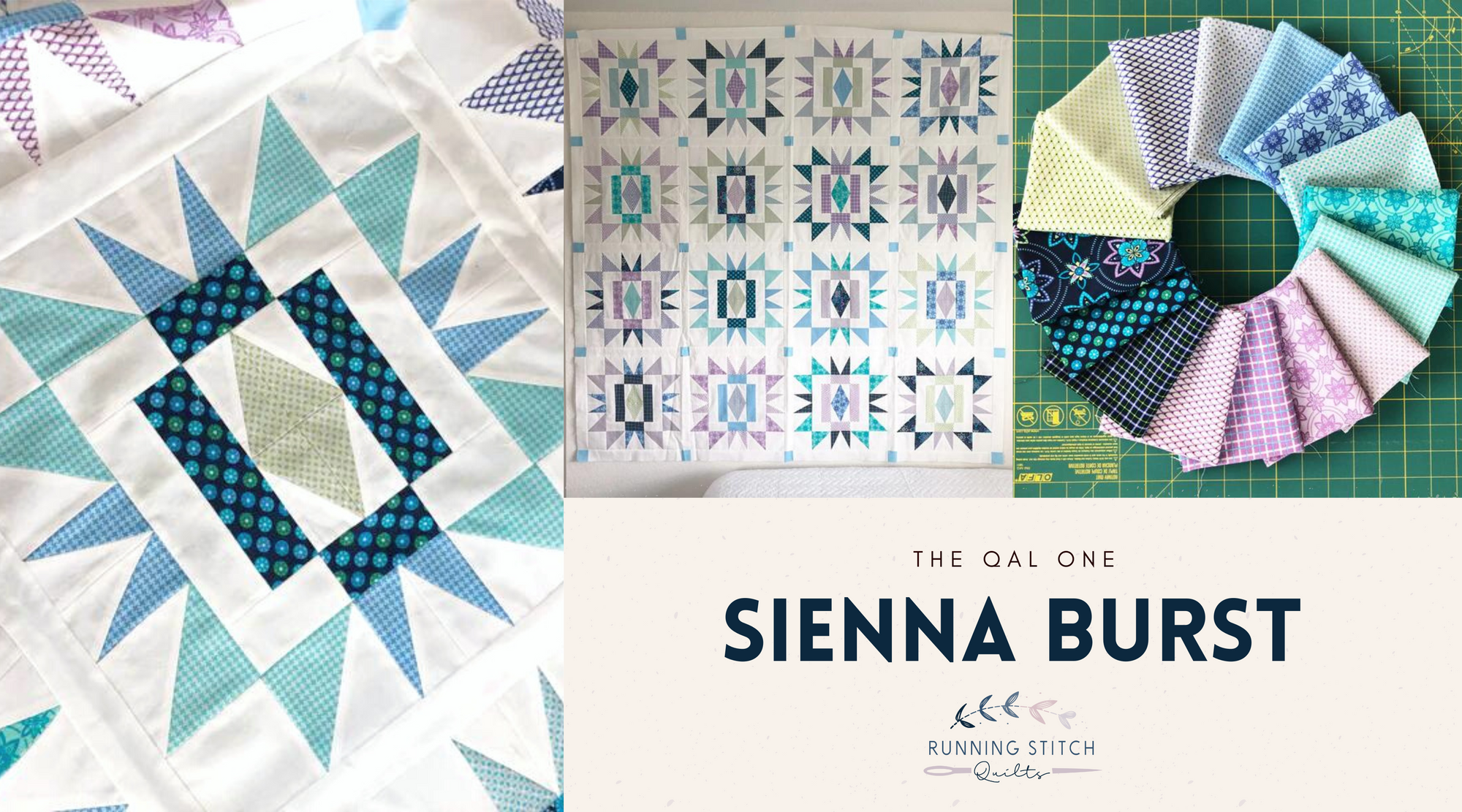
WIP: Sienna Burst Quilt Top
baby
quilt pattern
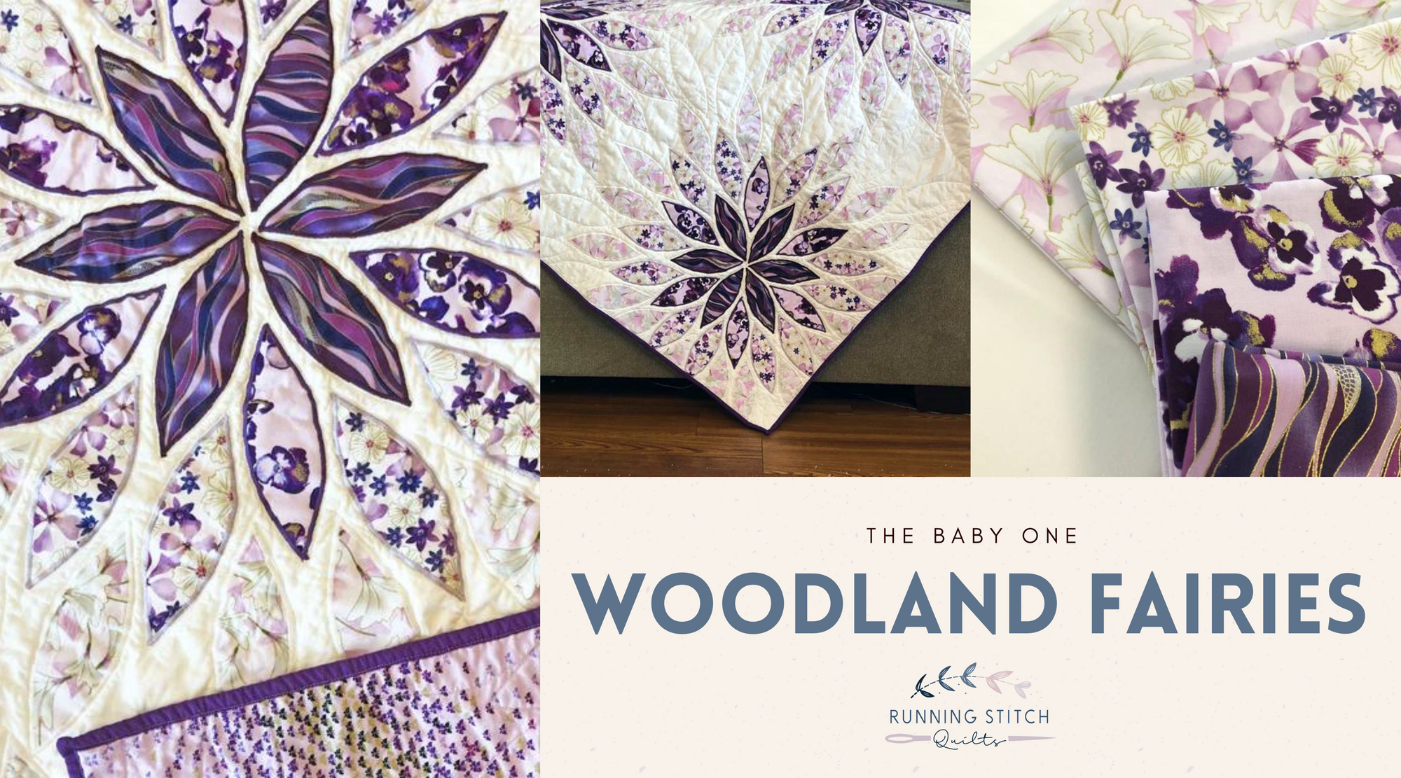
Woodland Fairies Baby Quilt
cover quilt
Moda
quilt pattern
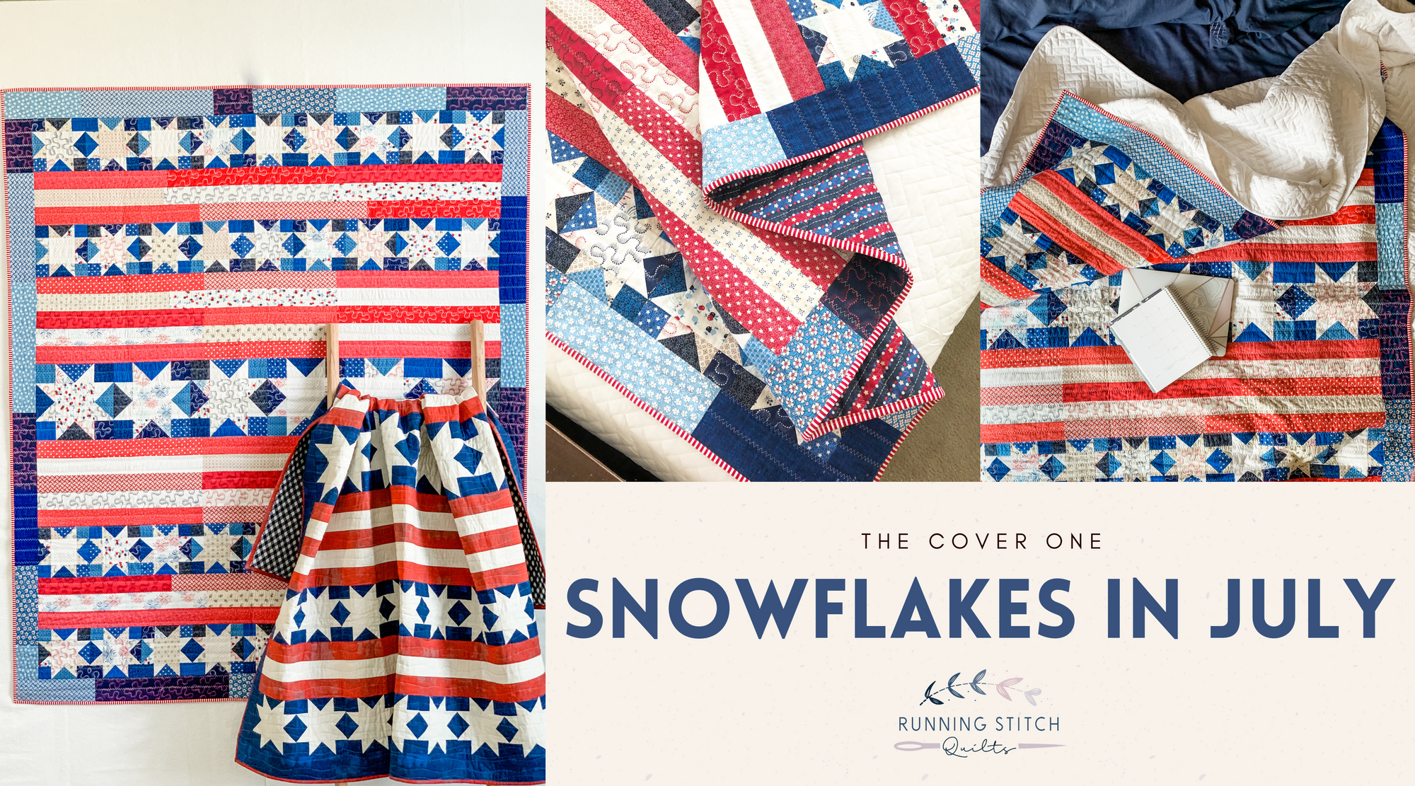
Snowflakes in July
Snowflakes in July Quilt Pattern
art gallery fabrics
baby
dear stella
michael miller
quilt pattern
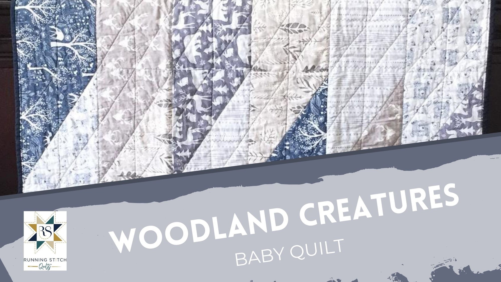
Woodland Creatures Baby Quilt
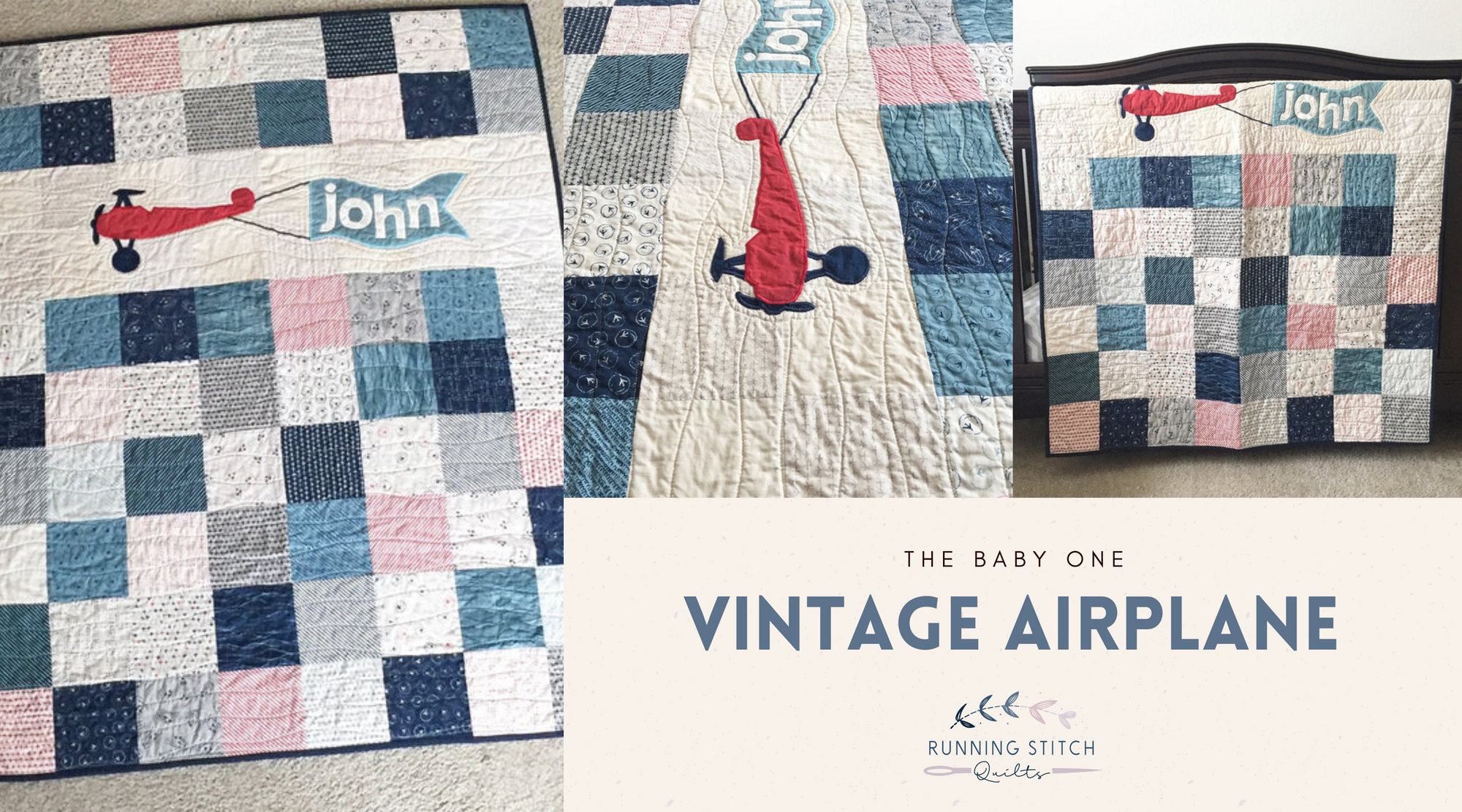
baby
quilt pattern
Vintage Airplanes Baby Quilt
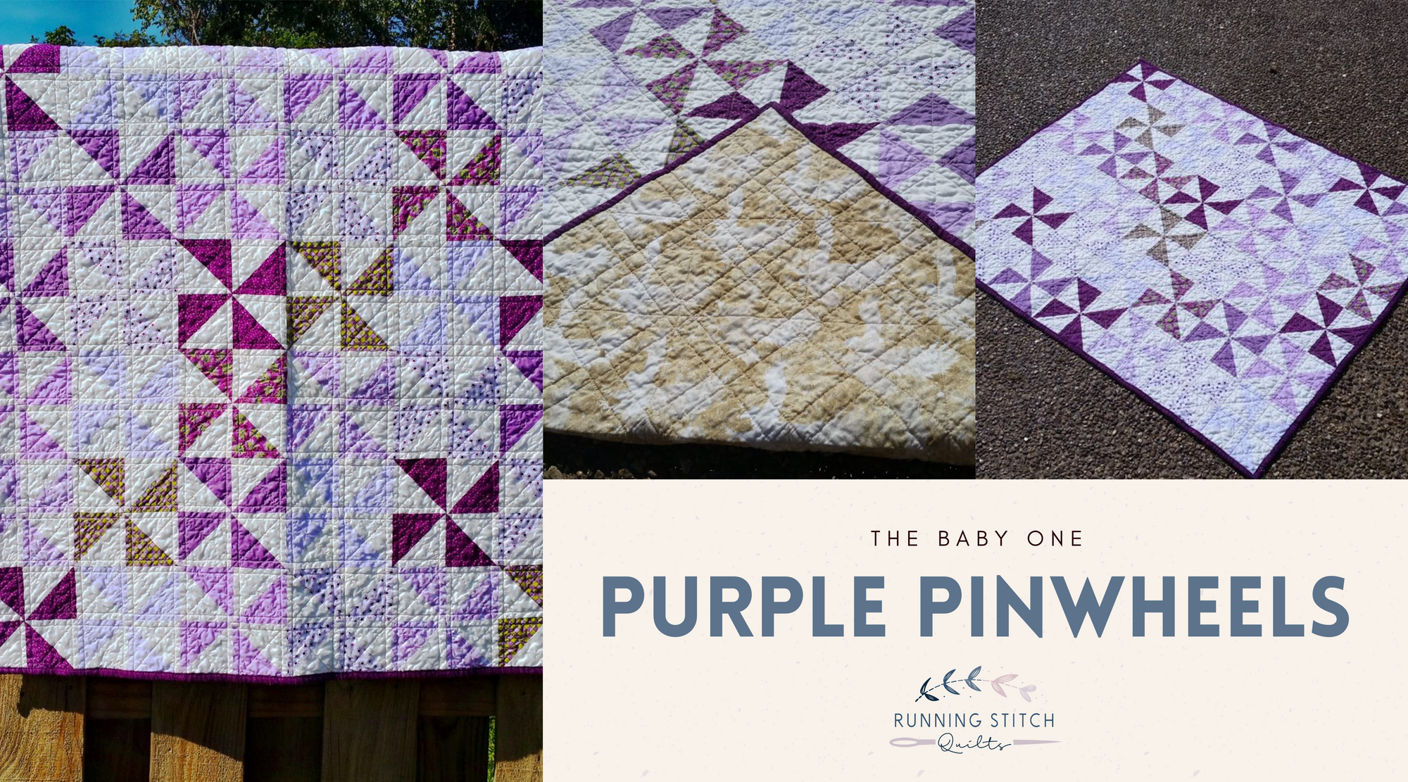
quilt pattern
triangles
Purple Pinwheels Baby Quilt
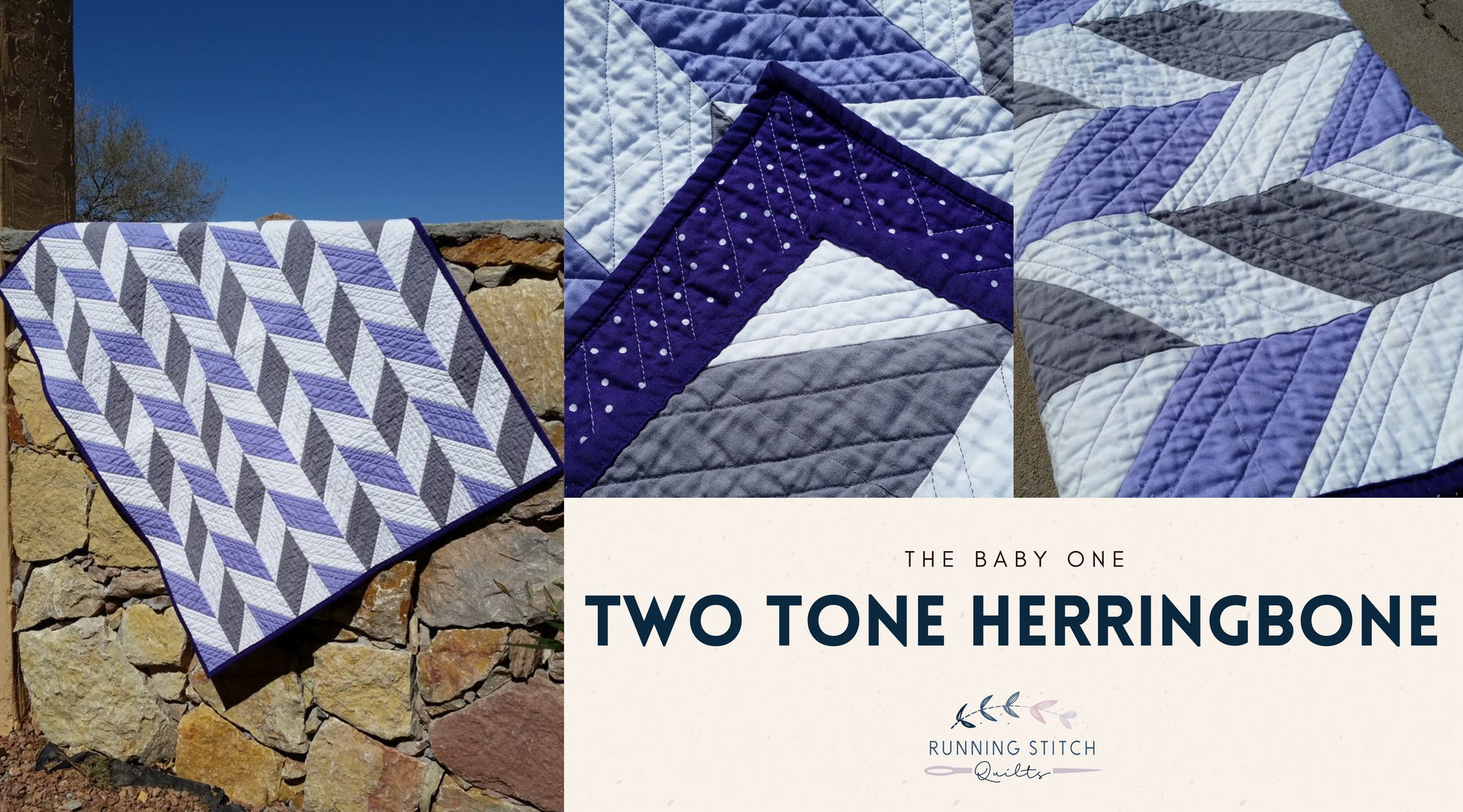
quilt pattern
riley blake designs
robert kaufman
solids
Two Tone Herringbone Baby Quilt
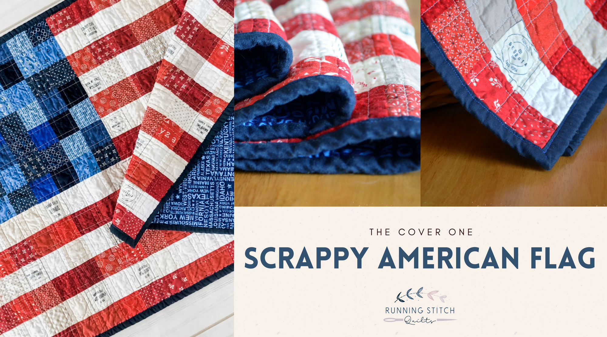
American Flag
Moda
quilt pattern
robert kaufman
scrappy
Scrappy American Flag Quilted Wall Hanging
Previous
1
2