The Deltille Quilt is here!

I feel like I have been talking about and sharing this quilt for ages. In fact, I first shared this particular quilt in April! I had gotten this box of beautiful fabrics from Michael Miller Fabrics (as part of their brand ambassador program) and I knew I wanted to make something special with them.

It had been on my mind to design a pattern that showed off larger scale prints. I tried a couple designs using larger squares and rectangles in various combinations, but none of them really jumped out at me. Then I started playing with triangles, and eventually landed on the Deltille design.

I sent my mock ups to my Director of Creative Names (ie: my best friend) who went down the Google rabbit hole until she found this website that described the word "Deltille" as another word for "triangular tiling". And if that wasn't more perfect I don't know what is!

Once I figured out the design, I immediately cut into my fabrics to see if it would work. I had to tweak the sizing a bit and make some adjustments on the fly, but I LOVE how it turned out.
Since I had a good mix of fabrics, I went with a scrappy layout and mixed and matched my blocks until I had a good balance. I saved the chunky red and white stripe print for the binding. I can't resist using stripes for binding when I have that as an option.

The hidden surprise in this quilt is the back though! This fabric collection has a really fun panel that has 4 half yard designs. I cut out each panel and sewed them into the quilt backing.


My only regret is that this quilt isn't bigger! It would make a perfect summer picnic quilt.


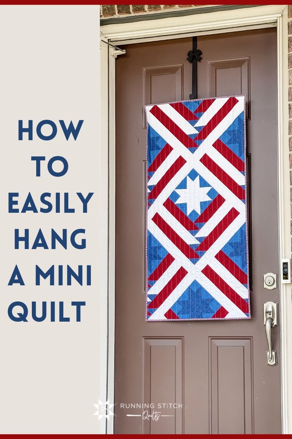
When I got the opportunity to sew something with these gorgeous Riley Blake Designs basics, I knew I had to make a Mountain Valley wall hanging. I modified the pattern slightly to get a flag effect, and I love the end result so much!

The Riley Blake Designs basic, Textured, is one of my favorites. It has subtle depth without being over the top about it. I'm using Navy, Barn Red, Denim, and Cream.


I knew I was going to want to hang this when I was done, so I went to my old mini quilt hanging method standby: corner tabs.
Using corner tabs is my favorite way to easily hang a mini quilt on the wall that will not be seen from the front. The tabs get sewn into the binding making it a permanent solution. Then all you need to do is pop in a small dowel rod and hang the rod on a couple of command strips. See, so easy!

Couple housekeeping things: this method is best for smaller quilts (think less than 24 inches or so). For a quilt wider than 24 inches, I would probably make a hanging sleeve. The quilt also needs to be unfinished. If the binding is already attached, an alternative method (like a hanging sleeve) is more appropriate.
- Quilted Wall Hanging - quilted, but no binding yet!
- (2) 5" squares of coordinating or matching fabric
- Binding
- Dowel Rod (I used a 1/4" dowel rod that I got from Home Depot. I've also seen them at Hobby Lobby)
- Command Hooks

1. Fold 5" square diagonally into a triangle and press.


2. On the back of the quilt, place one triangle in each corner on the top edge. Pin in place.


3. Bind quilt as usual. I attach my binding to the front, fold it over to the back, clip in place, and stitch the ditch from the front to sew it down.


4. The triangles are now corner pockets that will hold a dowel rod.

5. Attach command hooks to the wall.

6. You might need to cut your dowel rod down to size. I did! Hang the dowel rod on the command hooks and admire your new wall hanging!


I had a hard time deciding what to make with these fun fabrics! I wanted to make a Rivermill, but I hated the idea of cutting up these beautiful prints. After playing with several mock ups, I finally settled on a Noughts and Crosses quilt. The center squares of this pattern are perfect for fussy cutting, and these prints are perfect to be fussy cut!

For the main fabric, I used the Darling Bouquets print. Combined with the white background, I love the softer, more subtle overall impression it gives the quilt. Plus, the pots are super fun and make a great feature.

In addition to the fussy cut llamas, I chose the blue and yellow florals to coordinate without being distracting.
And don't worry, I didn't forget about the sugar skulls! I loved this print so much I used it for the backing so I didn't have to cut into it at all! Haha!

I quilted my go-to serpentine stitch about 1.5" apart. I love this stitch because it gives a little bit of extra dimension without free motion quilting. Plus, it's quick!
To finish it off, I used the orange tie dye print for binding. I just love love love this quilt. It would be perfect for a baby girl!

After I finished this quilt, I had just enough extra sugar skulls fabric to make two matching pillows. Adorable, right!?


See the entire La Vida Loca collection here! Michael Miller sent me these fabrics as part of their brand ambassador program. :)
I'm excited to introduce my latest pattern: Rivermill!

Rivermill is my take on the classic pinwheel block. I've been wanting to do a pinwheel block for a while now. After playing around with many (many) variations, I finally settled on this block.

I really like mix and match style blocks, so I made sure to include that with this pattern. As a bonus, I added the option to use half yards or fat quarters for a scrappier overall effect.

When I was trying to come up with the colors for the cover quilt I kept getting drawn towards blues and browns. I've never worked with brown in a quilt before, and I have to say, I'm obsessed with this ten color palette. It reminds me of the cold, snowy winter here in Michigan.


As always, I sent my quilt to Jill at J. Coterie for quilting. She chooses the best designs that complement the quilt top and really elevates the quilt to a whole new level.


I am currently in the process of making a new quilt for my oldest daughters bed. Since I am making her a new quilt, it only makes sense to make coordinating pillow shams too, right!?

For this project, I picked two pinks, two purples, and two teals from the new Michael Miller basics line, Coco. It was inspired by Coco Chanel and the subtle texture of the prints are beautiful! They still read as a solid, but if you get up close you can see the dimension in the print. I really enjoyed playing with these fabrics!

For the focal point of the pillow sham, I chose my Desert Charm pattern. It is a big block so it works well in the center. I also added flying geese to each edge to increase the size, but also because I liked the extra element versus just adding more background fabric.
Anyway, read on to see how I made these. :)
--
1. Make your pillow sham quilt panel. A standard pillow sham is 20" x 26" so your quilt top should measure 20.5" x 26.5" unfinished.

2. Make a quilt sandwich with quilt top, batting, and backing. Spray or pin baste.
3. Quilt as desired. (I did 1/2" straight lines).
4. Set aside.
1. Cut (2) 17" x 20.5" pieces from the backing fabric.
2. On one 20.5" edge, fold over 1/4" and press, fold over 1/4" and press again. Then top stitch that edge.

3. Repeat with the other fabric piece.
1. Lay your quilted pillow front right side DOWN.
2. Place the raw edges of the pillow closure pieces right side DOWN on top of the pillow front (so these pieces are wrong sides together).

3. There will be about 5" of overlap.

4. Use pins or wonder clips to hold all the pieces together.

5. Sew around the edge with a scant 1/4" seam (so that this seam is hidden by the binding)

6. Bind as usual.

7. Stuff a pillow inside and enjoy your work!


Meet Square Burst 2.0!

It is exactly the same pattern as the original Square Burst just brighter and happier. Don't get me wrong, thought the fabric in the original quilt was cute, but I love this brighter one just a tad more. It feels more ME!

Coming up with 21 Kona solids was a bit of a challenge, but it ended up being fun. I started with my current favorite colors (Windsor and Foxglove) and started adding from there. When I had 21, I would start swapping out one or two until I was happy with the final result.

In the end, the final 21 Kona colors were: Evening, Dusty Blue, Blueberry, Blue Bell, Windsor, Sage, Aloe, Berry, Plum, Mulberry, Amethyst, Lupine, Princess, Lilac, Dusty Peach, Blush Pink, Deep Rose, Rose, Ballet Slipper, Sea Glass, and Carribean.

I sent this off to my favorite long armer, Jill, to work her magic. She chose the Birds of a Feather panto, and its just lovely! I really enjoy sending her my quilt tops and letting her choose the quilting design. Its always a fun surprise to open my quilt back up when it gets home and see the result. Jill hasn't steered me wrong yet!

For the binding, I went with the striped fabric that is in the Minimalist version. Striped binding is my favorite and I will always choose that if its an option!

Now for pictures!


If you want to read about the rest of the Square Burst 2.0 series, you can do that here!


The Cornerstone Square Burst quilt is the second quilt in Square Burst 2.0 series!

Fun fact, when I was coming up with the quilt design, this was the original coloring placement I was going to go with. When I design patterns, I like having a feature/accent fabric that is the same across all blocks that helps tie them together. The super scrappy variation came from a desire to have a fat quarter friendly option!

This quilt uses the same 21 Kona colors as the super scrappy variation with the addition of Essex linen in Chambray. I really liked how the texture of the chambray was a nice offset to the combination of colors. It looked like it belonged in the group without being overly matchy-matchy.

I quilted this one myself with a wavy stitch that is about 2.5" apart. In hindsight, I should've added another row of stitches in between, but that's okay! The less dense quilting makes the quilt soft and squishy. The drape is lovely and I think it will crinkle nicely when washed!

I used a gorgeous print by Rahsida Coleman-Hale for the backing from her Akoma line for Cotton + Steel. It is a beautiful teal color with pinkish/purple florals that compliments the front perfectly.

For the binding, I used Kona in Lilac that I had leftover from the backing of my cover quilt. (#thriftyquilting).


If you want to read about the rest of the Square Burst 2.0 series, you can do that here!


The Minimalist Square Burst is the third, and final, quilt in the Square Burst 2.0 series. This variation uses just two fabrics to create a more modern look!
Is this my favorite quilt I've ever made? Maybe.

I love absolutely everything about this quilt. From the texture of the Essex linens, to the softness of the Art Gallery print on the back, to the striped binding, and the overall sense of coziness I feel when I look at it. This quilt has my heart!

When I set out on the task to make this quilt series, I chose the fabrics for this quilt first. I looked at the Essex 1/4" Stripe colors available that had a matching solid to narrow my choices. I was debating between chambray (which I chose), a cream/tan color, or a black/gray color.

I knew I wanted to use one of the fabrics from this quilt as the cornerstone fabric of the Cornerstone quilt. Ultimately I chose chambray because it kept with the 'bright and happy' theme I was going for.

For the backing, I went with the cream and white floral from Art Gallery Fabrics Lower the Volume collection. It gives the quilt the perfect Joanna Gains farmhouse vibe when paired with the neutrals and stripes on the front.

Speaking of stripes, I used the striped fabric from the quilt as the binding. Striped binding is my favorite and I will use it any chance I get. ;)


I quilted it with a diagonal crosshatch about 1.25" apart. I think the simple straight line quilting adds to the timeless, classic look of the quilt!

Check out the rest of the Square Burst 2.0 series here!


While I loved the original Square Burst quilt, remaking the cover quilt has been on my To Do list ever since I made it. I wanted a brighter, more colorful quilt on the cover.

Not only did I remake the cover quilt, I also made other variations of the pattern with similar fabrics. Seeing these three quilts together brings me so much joy!


When I added the new cover quilt to the pattern, I also updated the layout inside. The cornerstones and minimalist variations used to be a bonus page, but now they are written into the pattern itself.

If you want to buy the updated version, you can do that here (paper or PDF). However, if you want to save a few dollars, you can buy the old pattern here (paper version). It is exactly the same information, it just looks different!


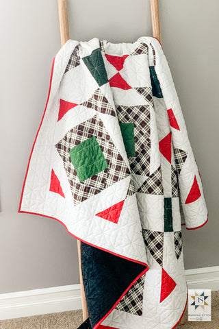
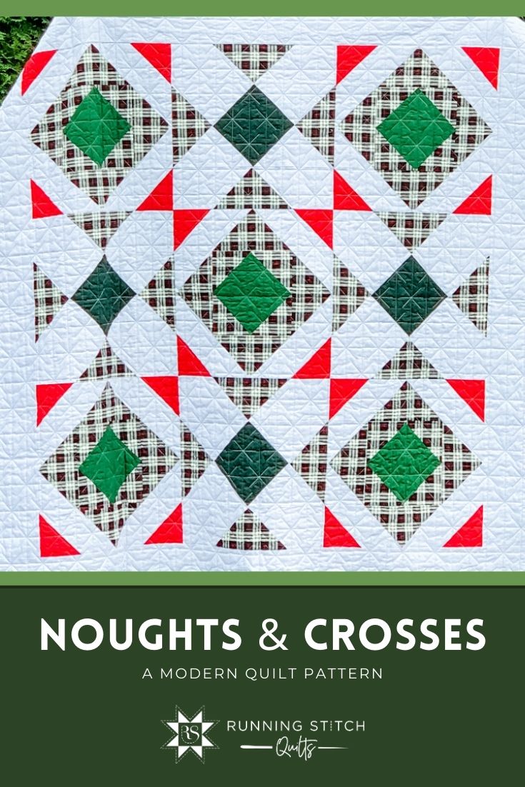
Back in February, I hosted my first quilt along with my Noughts and Crosses pattern. When the QAL ended, I packed my quilt away to prep for our move to Michigan. Well, I finally pulled the quilt out, got the binding added, and took some pictures. I am excited to finally share the finished quilt with you!

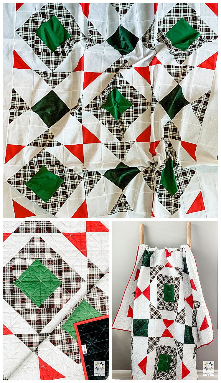
When I first saw this black plaid from the Riley Blake Winterberry line, I knew I had to make a Christmas quilt with it. I loved this print so much that I bought a five yard cut of it. FIVE YARDS. What can I say, it was an impulse buy after the Christmas season and it was getting hard to find. That's okay though, there is plenty if fabric leftover to make stockings, a tree skirt, and maybe a couple of pillows.

For my Christmas quilt, I used the plaid as my feature print and paired it with Kona colors Evergreen, Basil, and Rich Red. The background is Essex Linen in Metallic Crystal. Photos really don’t do this fabric justice, the sparkle is so pretty in real life.

The quilting was done by Jill of J. Coterie Quilting. I let her pick the panto and she chose the fun starburst/snowflake design. Jill also carries a selection of minky to use as backing, so I asked her to back it with a black minky. Oh my goodness, it is so soft! My toddler has claimed this quilt as hers and has also requested that all my quilts be the “cuddly kind” from now on.

The original Noughts and Crosses pattern doesn’t include borders, but I added a 5” border on all sides for this one. I wanted it to be just a tad bigger so I can cuddle up with my family on the couch with it. Let's be honest though, I really just wanted more blanket to cocoon myself with. (I'm not a very good at blanket sharing!)
You can find the paper pattern here and the digital pattern here if you’d like to make your own. If you do, tag me in instagram with #noughtsandcrossesquilt and @runningstitchquilts so I can see!
But now, pictures!


I don't make commissioned quilts very often anymore, but when a sweet friend from college asked me to make her nephew a quilt, I couldn't resist. For one, I love her. And two, I made a baby quilt for her first nephew a few years ago!

She gave me a theme (western) and asked that the quilt look similar to the one I made originally. Other than that, I had free rein!
I found this super cute John Wayne fabric by Riley Blake, and I paired with with a cream/red star print from my stash.
I didn't use a pattern, but I cut out 5" squares and sewed them in random order, and then I appliquéd the name and cowboy hats. I finished it off with straight line quilting 1/4" on either side of each seam.
Now...pictures!


The original inspiration for this quilt came from when I used to live with my boyfriend (now husband) at Fort Bliss in El Paso, Texas. We hiked in the Franklin Mountains and enjoyed spectacular sunsets at night.

When I saw the Warp and Weft line by Ruby Star Society I knew immediately I wanted to use it for this pattern. The combination of orangey brown, light pinks and purples, and navy fabric is exactly what I think of when I think back to my time in El Paso.

I made the wall hanging size, and it turned out exactly as I imagined.


|
Want a cute Mountain Valley sticker? You can get yourself one here! |
 |
