All orders placed between 5/3/2026-5/10/2026 will ship on 5/11/2026!
Log in
Cart (
0
)
Checkout
HOME
IMPROV
SHOP
PDF Patterns
Printed Patterns
Book
Fabric
Quilt Kits
Fabric Bundles
Backing Fabric
Fabric Destash
Notions & Gifts
Handmade Quilts
BLOG
Scrap Management
Tutorials
Color Inspo
ABOUT
WHOLESALE
CONTACT
LOGIN
HOME
IMPROV
SHOP
PDF Patterns
Printed Patterns
Book
Fabric
Quilt Kits
Fabric Bundles
Backing Fabric
Fabric Destash
Notions & Gifts
Handmade Quilts
BLOG
Scrap Management
Tutorials
Color Inspo
ABOUT
WHOLESALE
CONTACT
LOGIN
Blog
Home
Blog
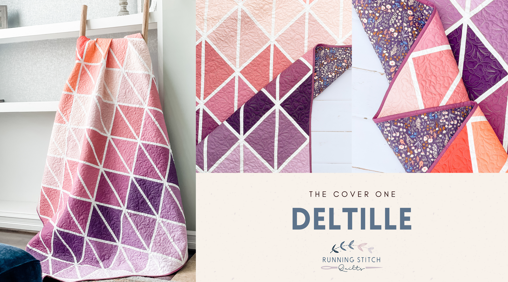
Deltille Quilt - The Cover Quilt!
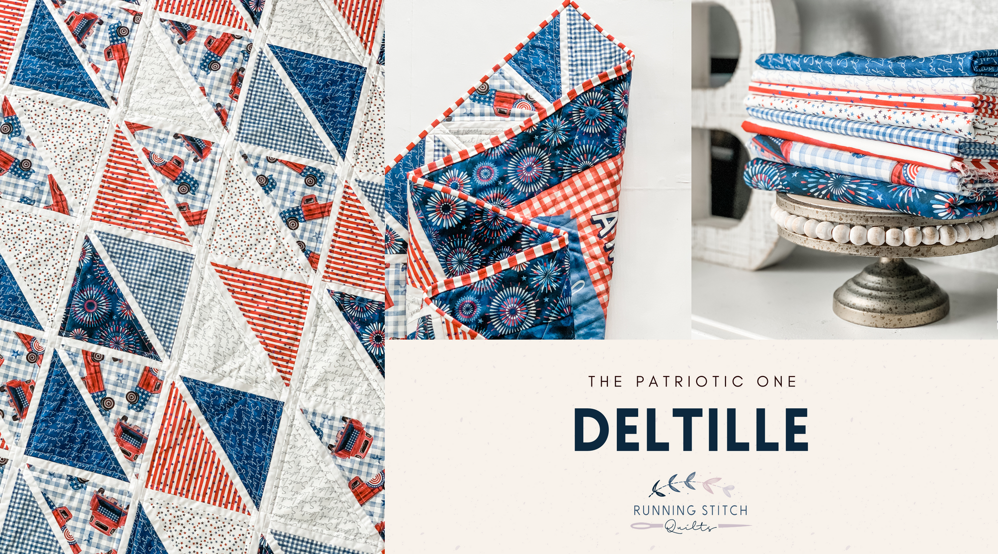
Deltille Quilt - The Patriotic One
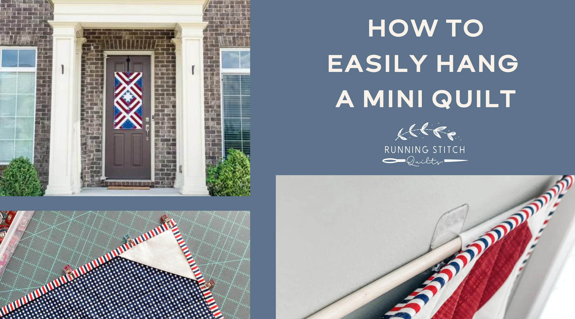
How to Easily Hang a Mini Quilt
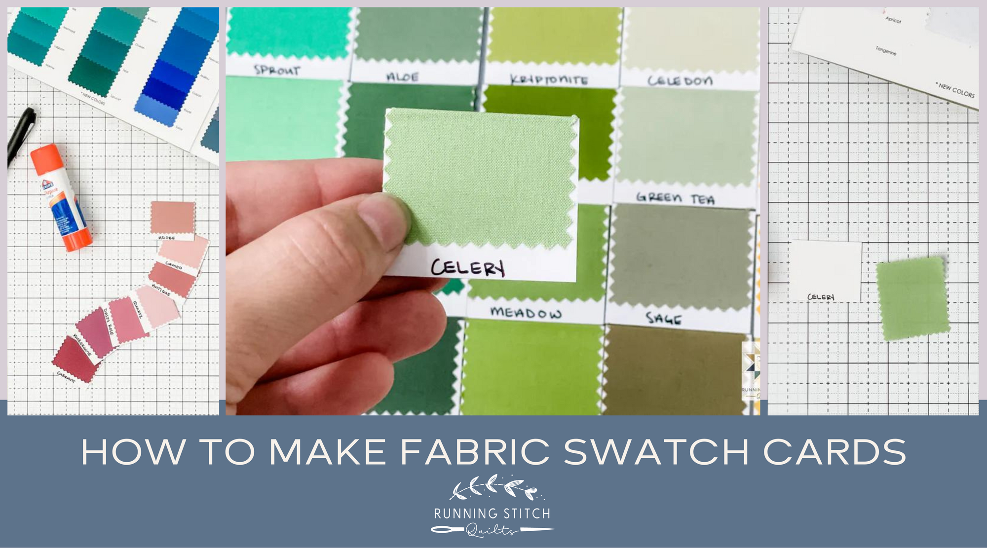
How to Make Fabric Swatch Cards
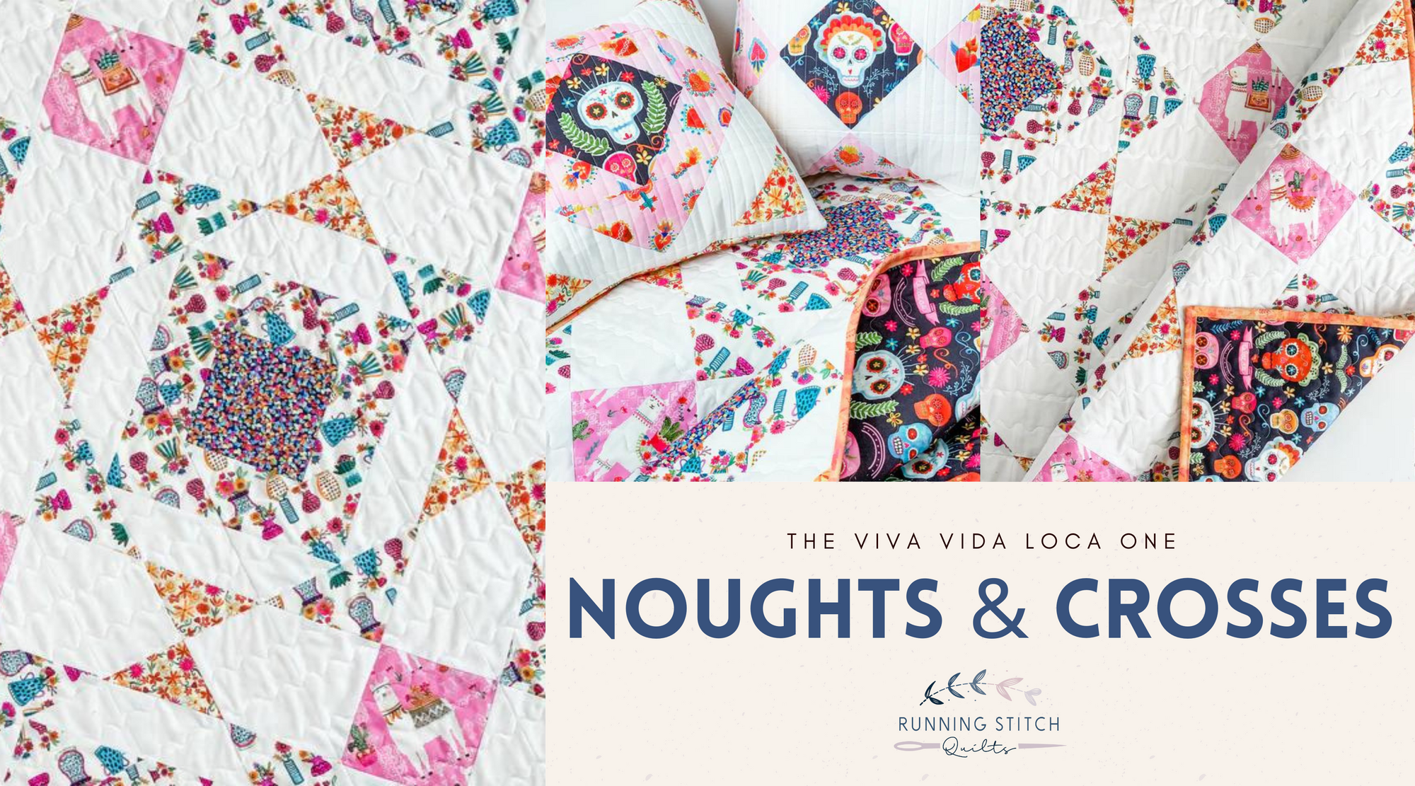
Noughts and Crosses Quilt - The La Vida Loca One
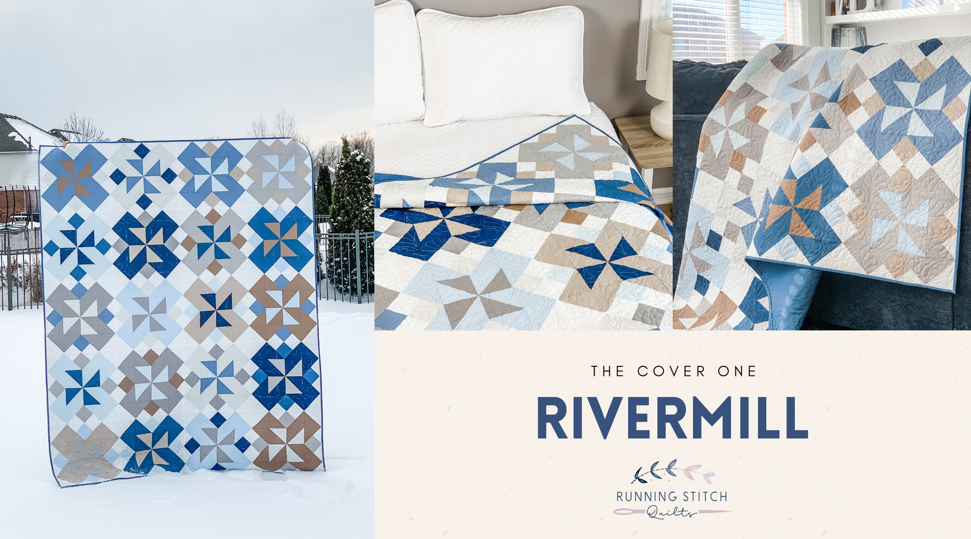
Rivermill Quilt Pattern - The Solids One
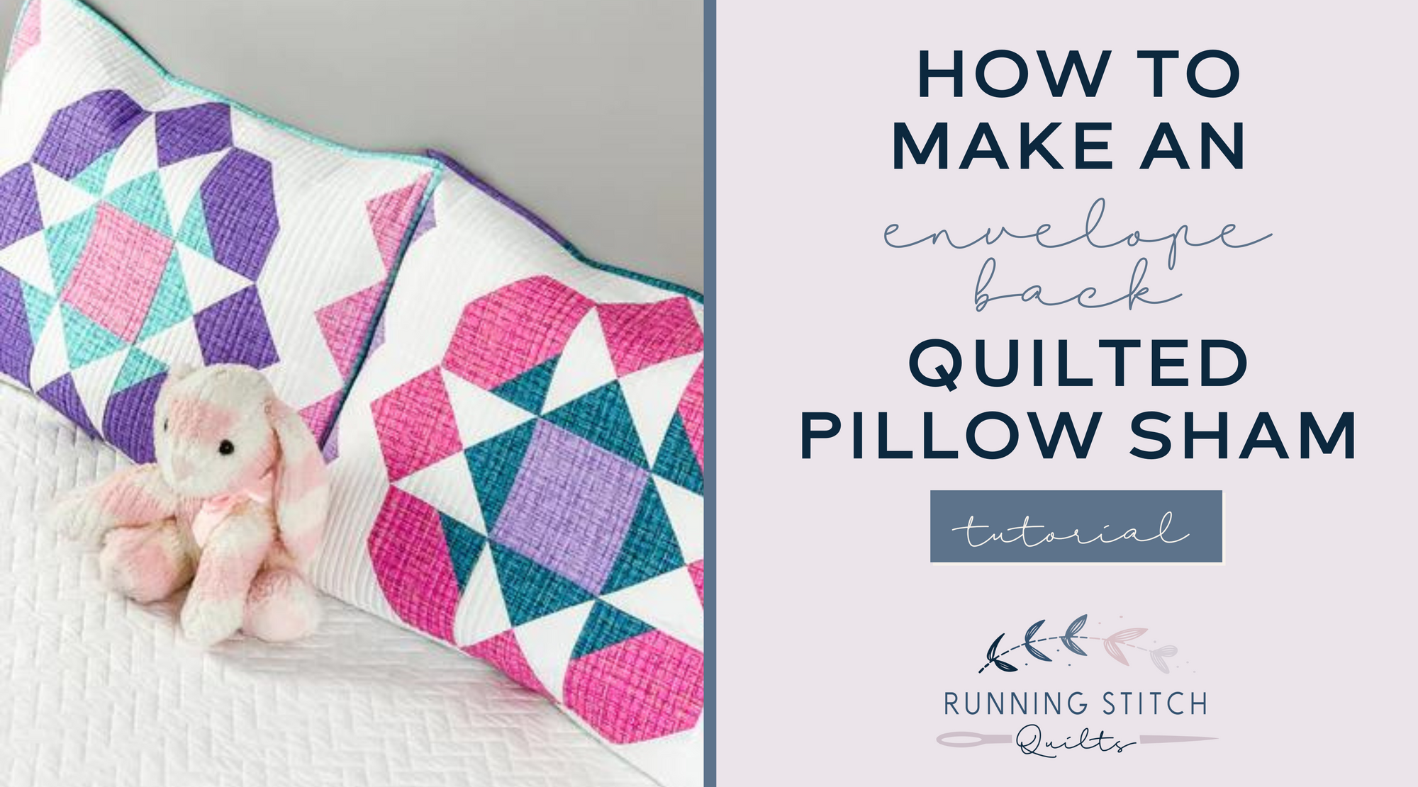
How to Make an Envelope Back Quilted Pillow Sham
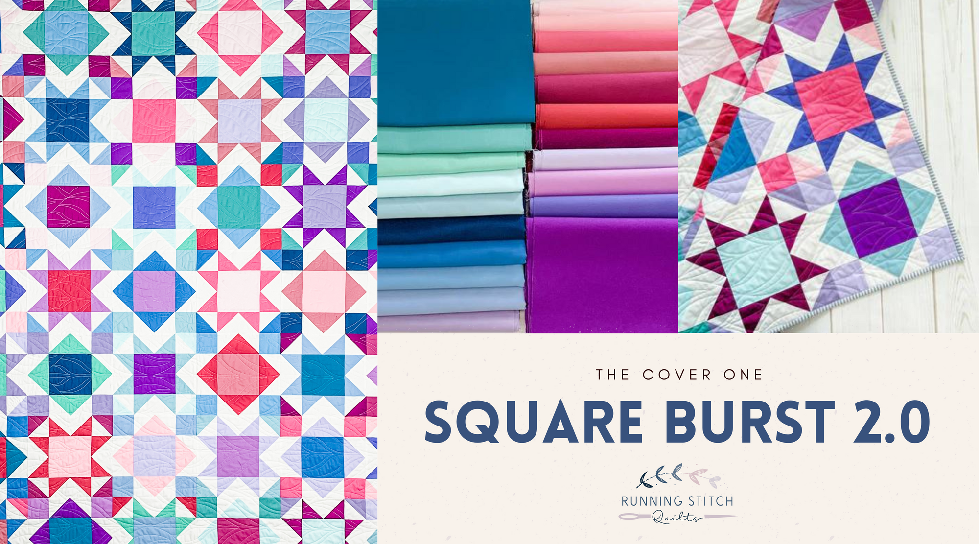
Square Burst 2.0 - The Cover Quilt
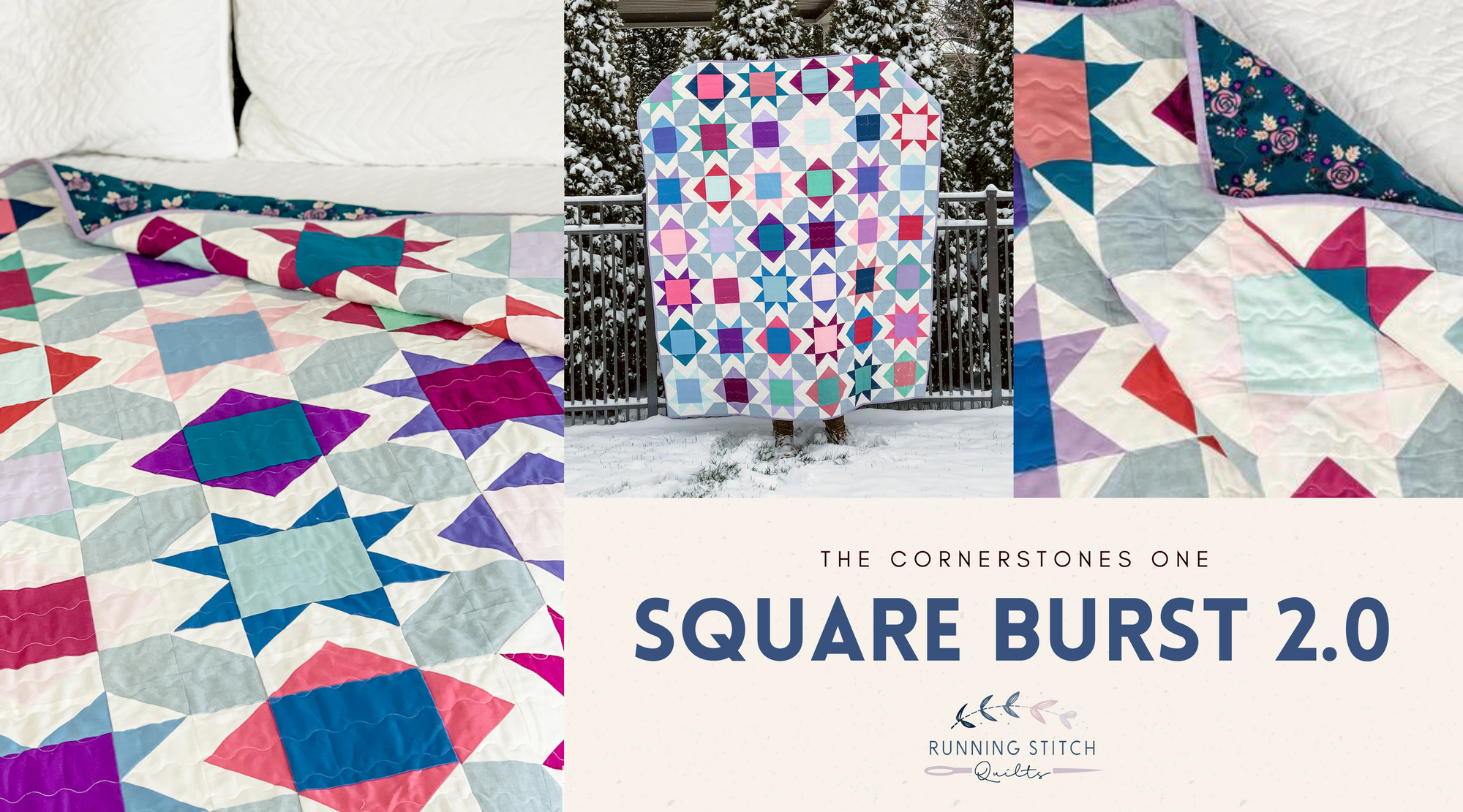
Square Burst 2.0 - Cornerstones
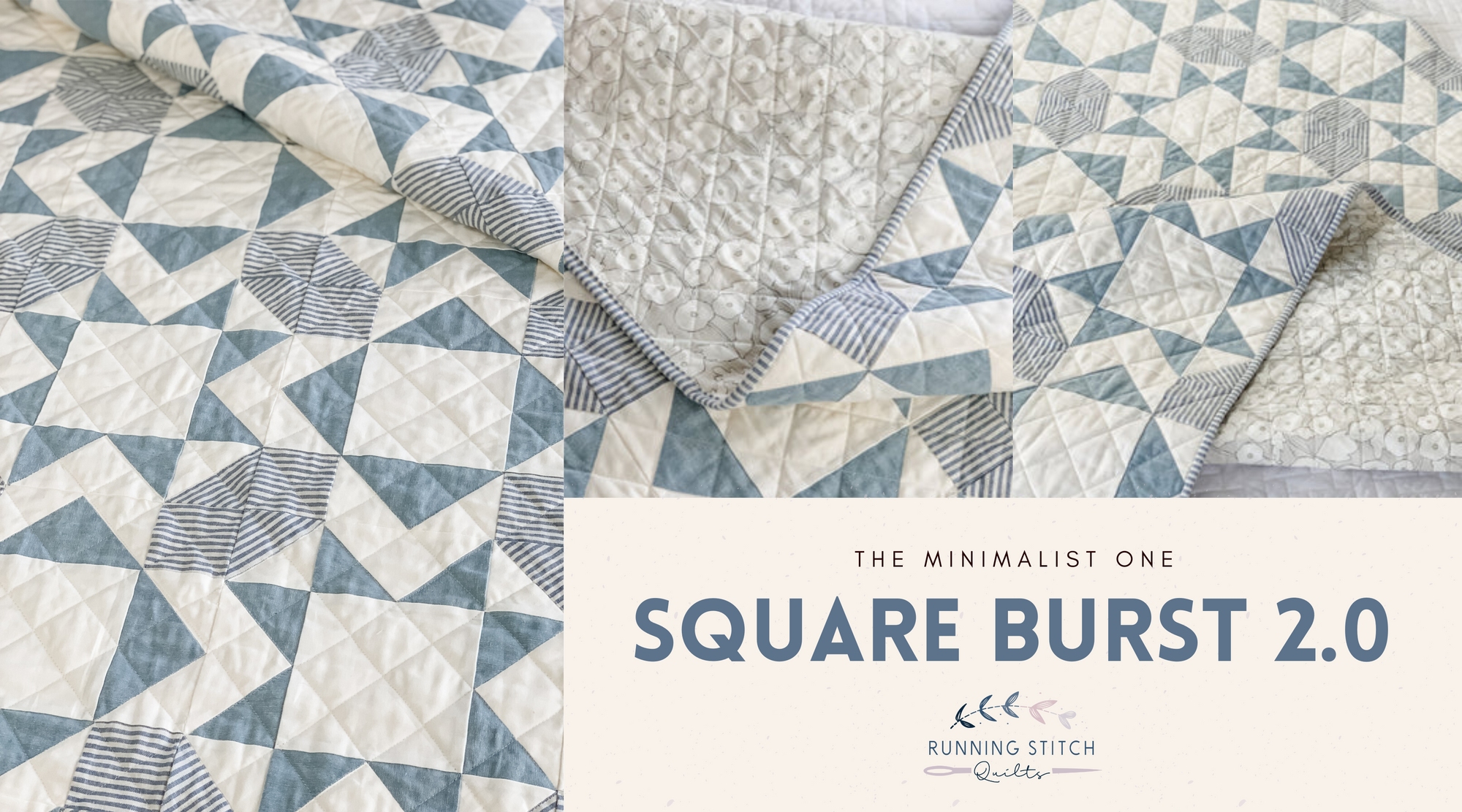
Square Burst 2.0 - Minimalist
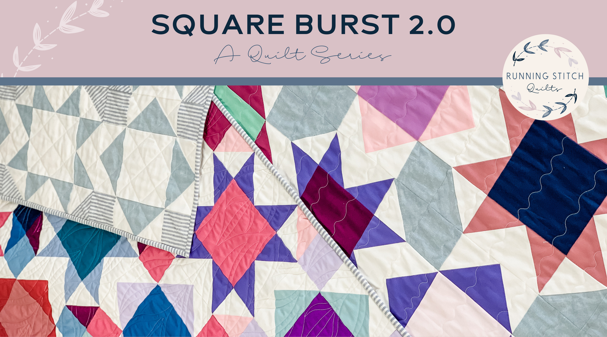
The Square Burst 2.0 Series
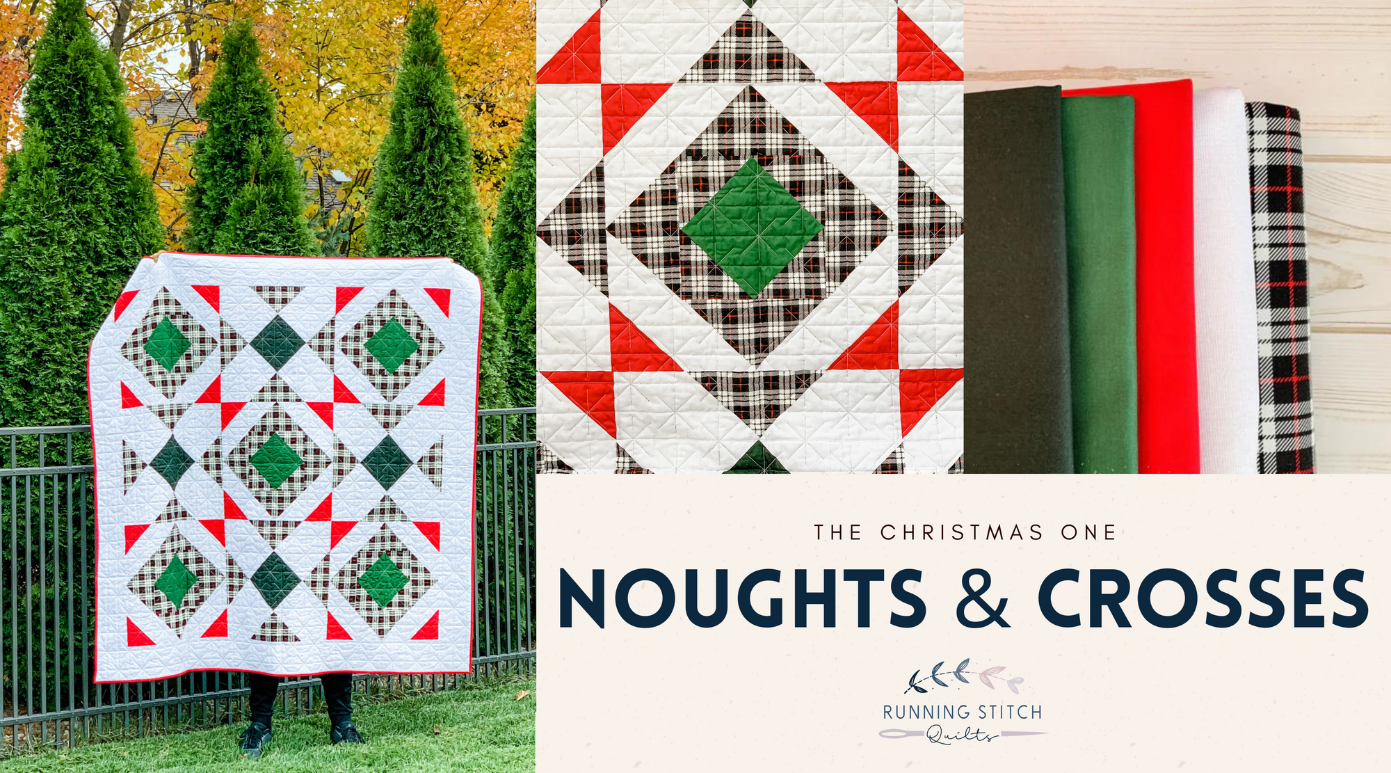
Noughts and Crosses - The Christmas One
Previous
1
…
4
5
6
7
8
9
Next
Search