All orders placed between 5/3/2026-5/10/2026 will ship on 5/11/2026!
Log in
Cart (
0
)
Checkout
HOME
IMPROV
SHOP
PDF Patterns
Printed Patterns
Book
Fabric
Quilt Kits
Fabric Bundles
Backing Fabric
Fabric Destash
Notions & Gifts
Handmade Quilts
BLOG
Scrap Management
Tutorials
Color Inspo
ABOUT
WHOLESALE
CONTACT
LOGIN
HOME
IMPROV
SHOP
PDF Patterns
Printed Patterns
Book
Fabric
Quilt Kits
Fabric Bundles
Backing Fabric
Fabric Destash
Notions & Gifts
Handmade Quilts
BLOG
Scrap Management
Tutorials
Color Inspo
ABOUT
WHOLESALE
CONTACT
LOGIN
Blog
Home
Blog
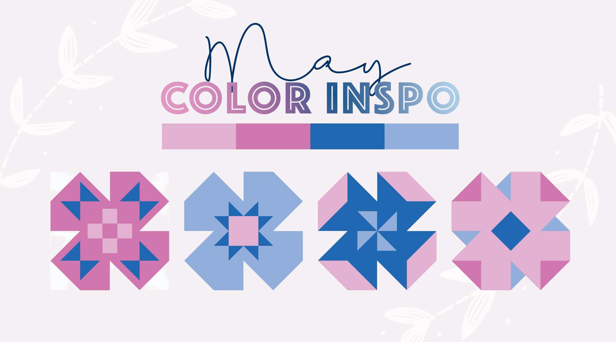
May 2024 Color Inspiration
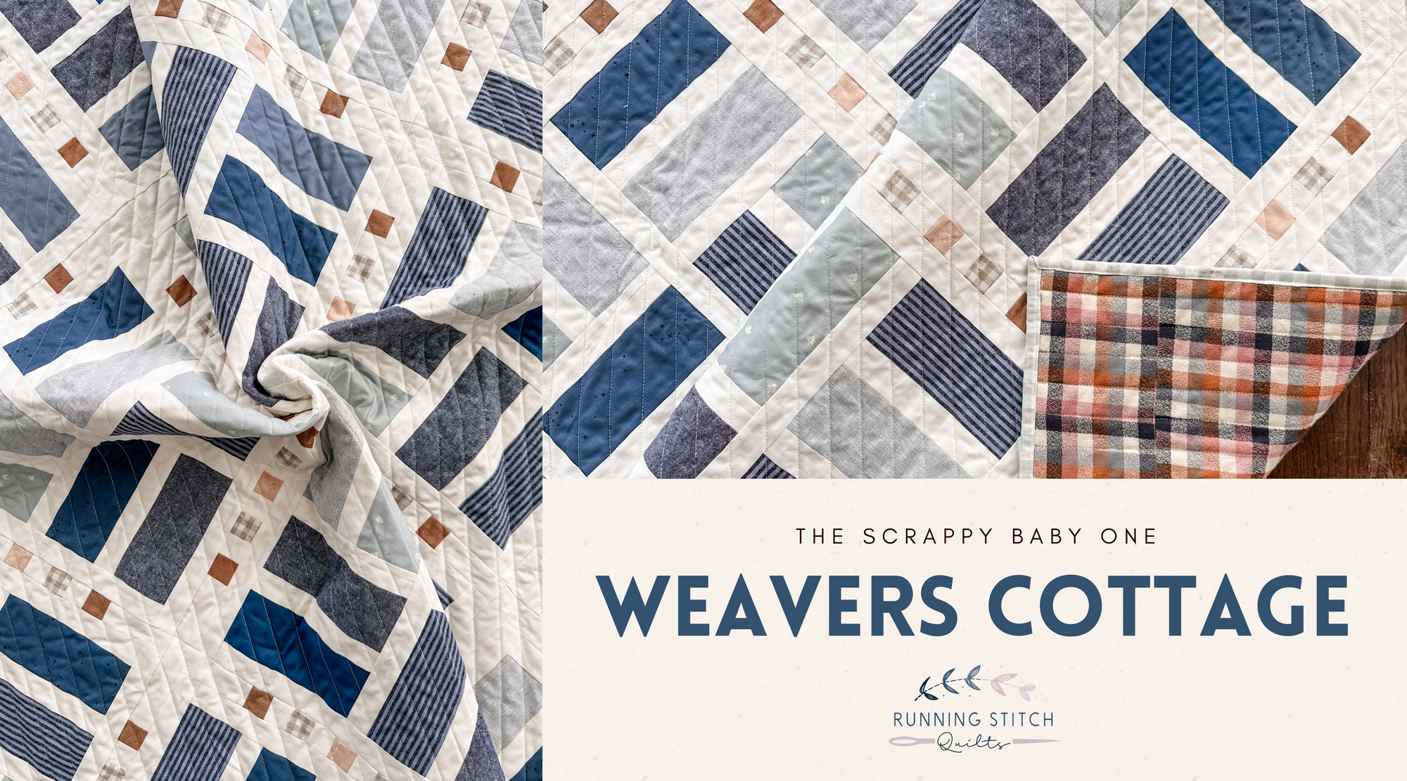
Weavers Cottage - The Scrappy Baby One
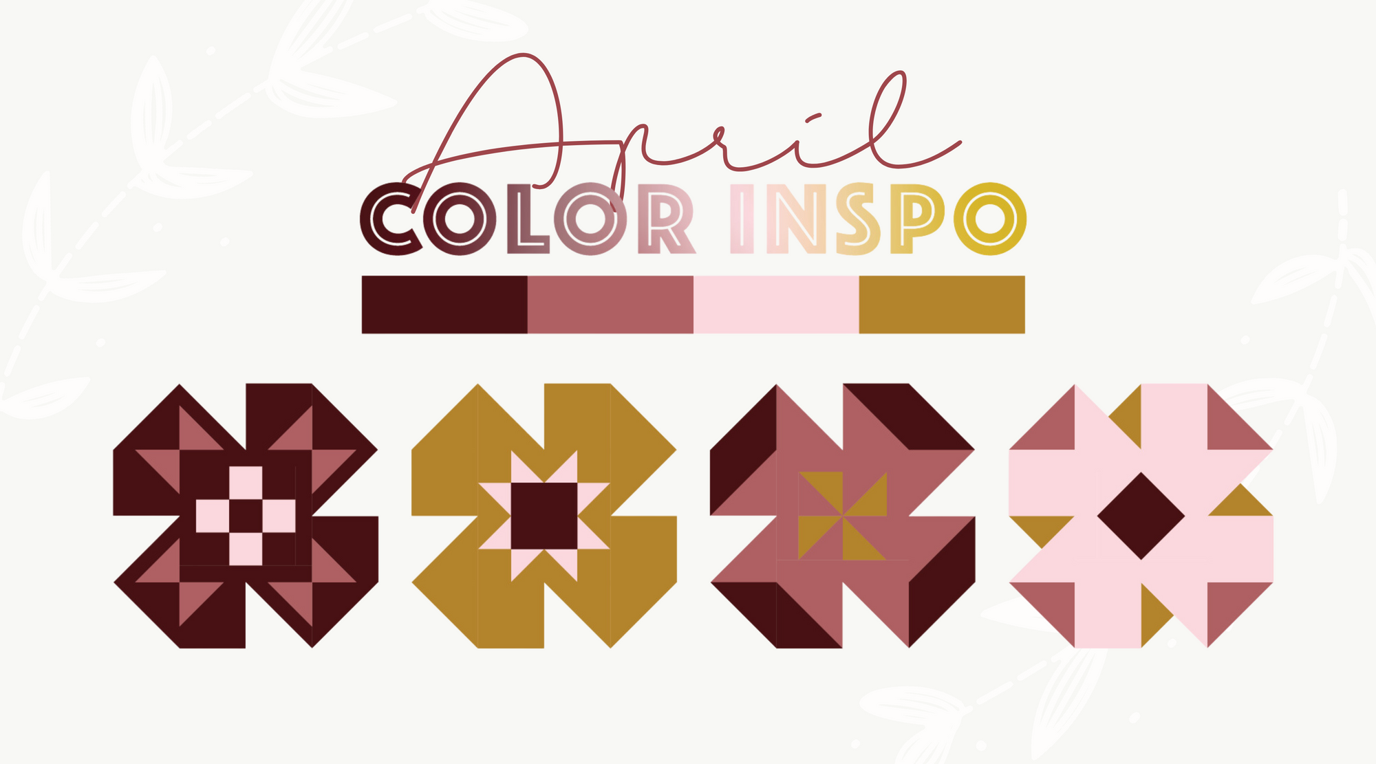
April 2024 Color Inspiration
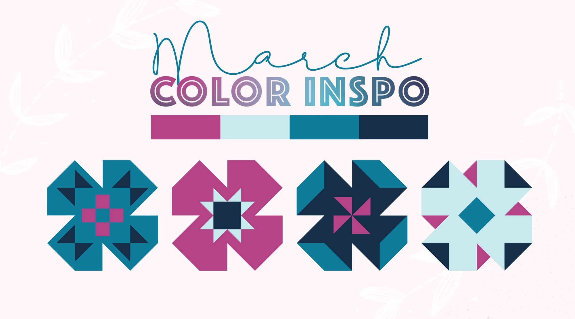
March 2024 Color Inspiration
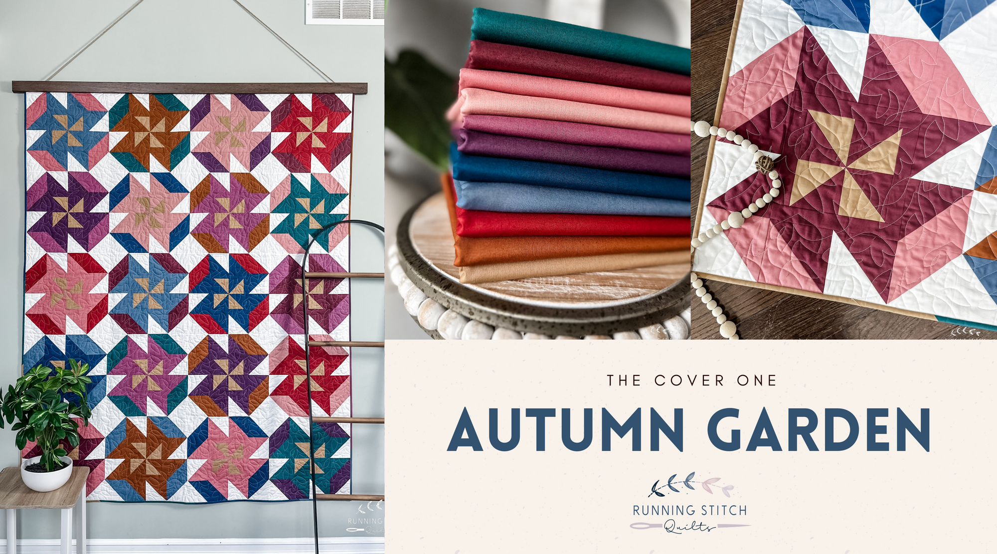
Autumn Garden - The Cover One
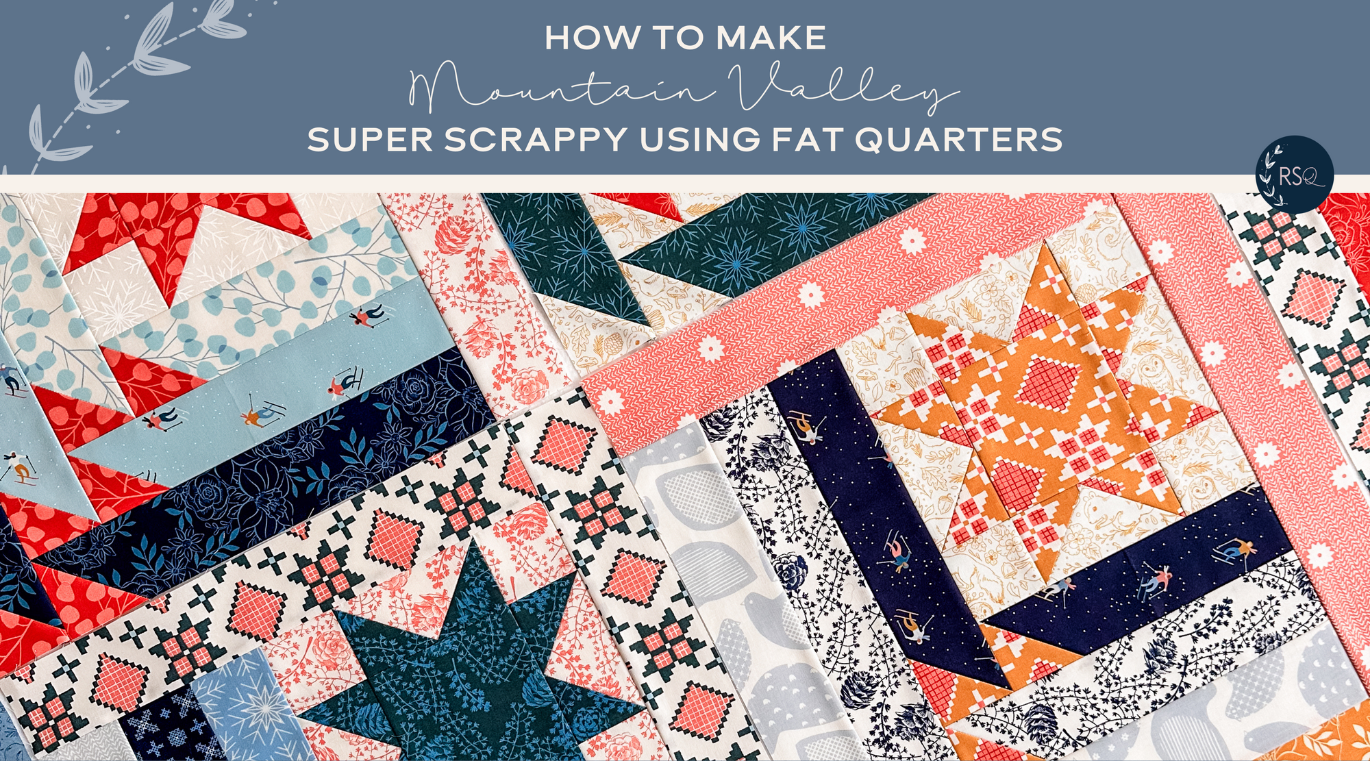
Scrappy Mountain Valley Quilt
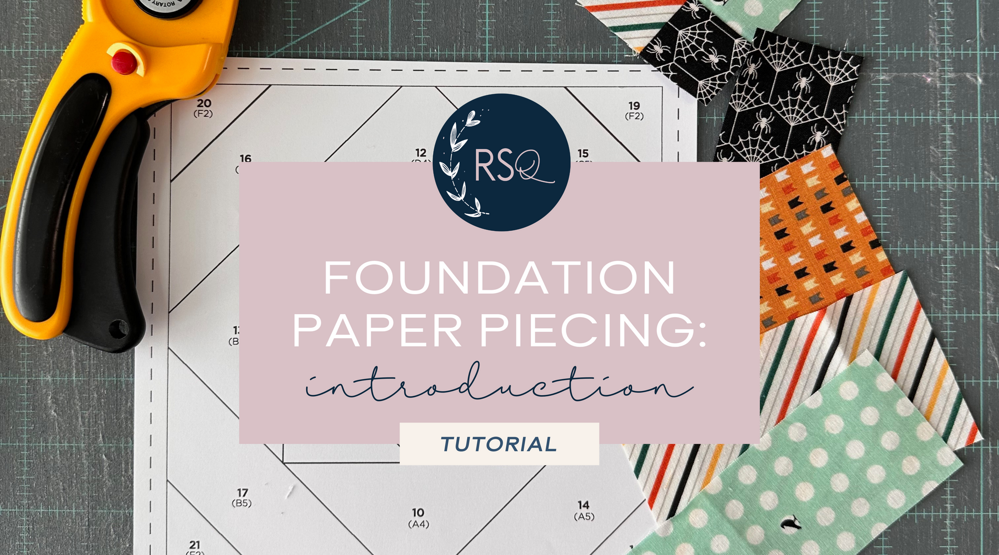
Foundation Paper Piecing: A Quick Intro
Chevron Stars - The Charlotte One
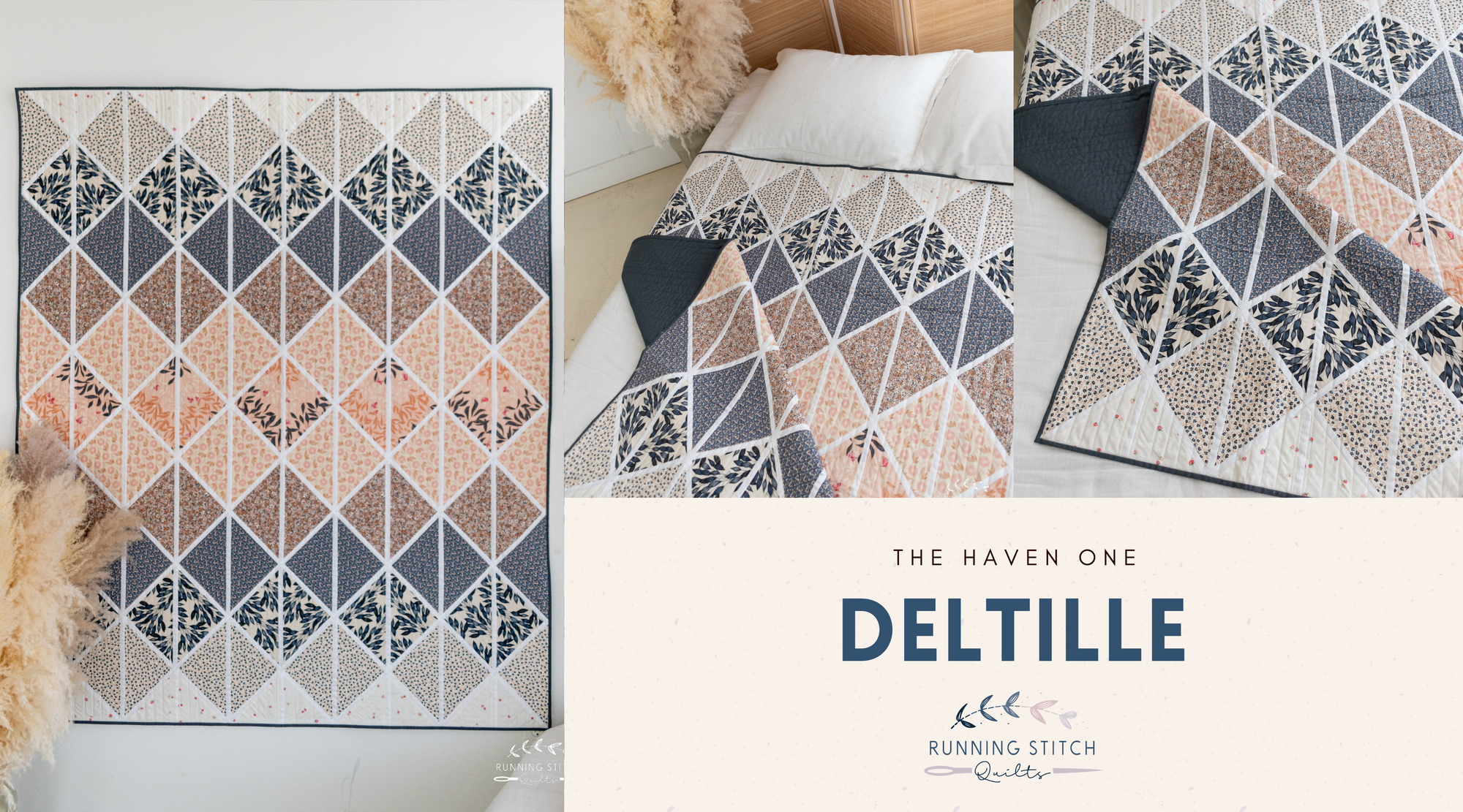
Deltille - The Haven One
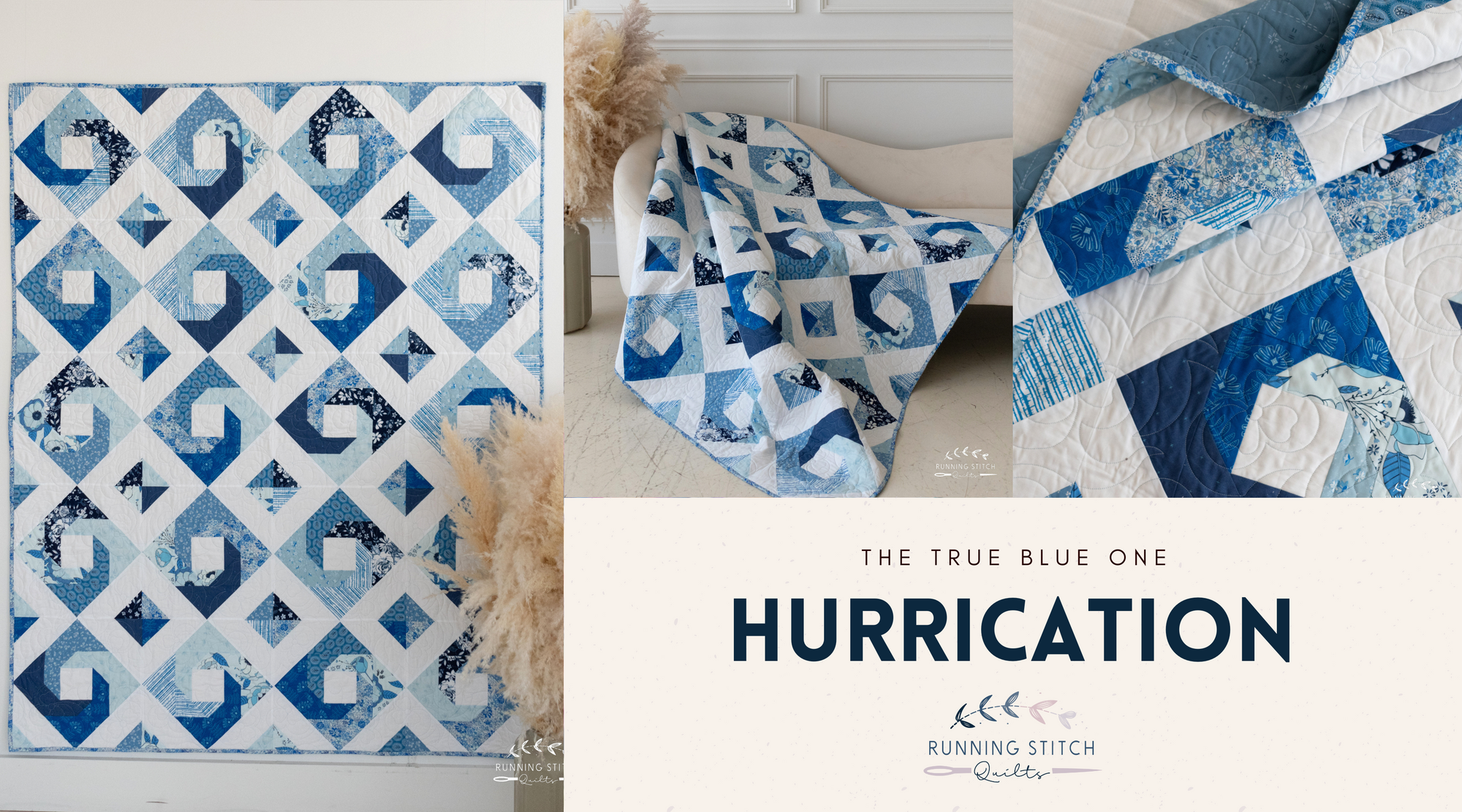
Hurrication - The True Blue One
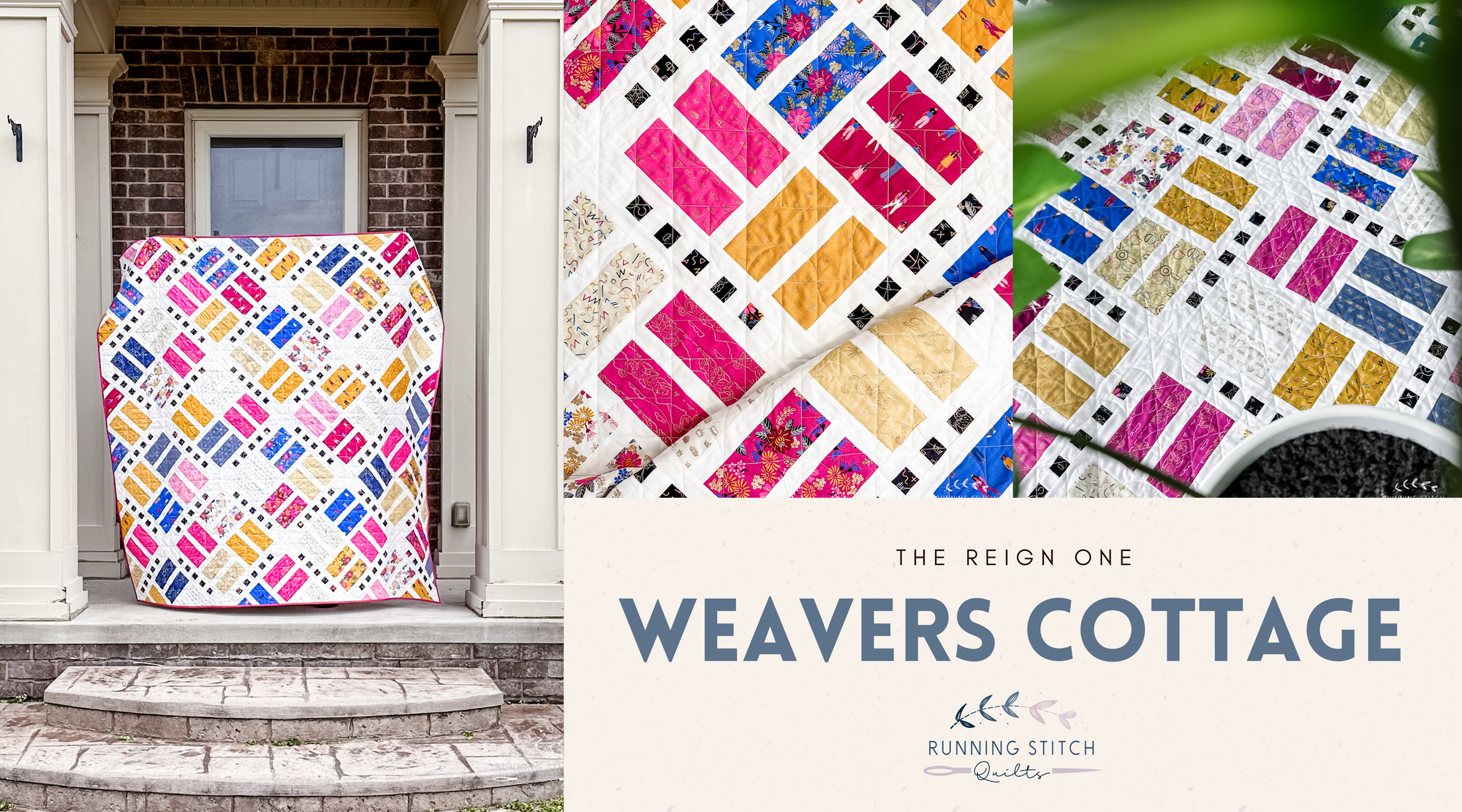
Weavers Cottage - The Reign One
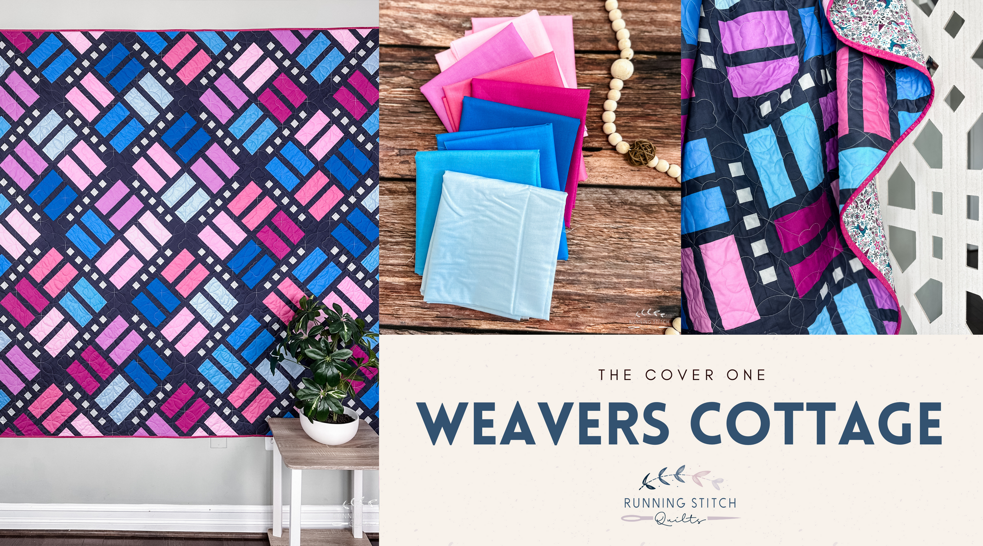
Weavers Cottage - The Cover One
Previous
1
2
3
4
…
9
Next
Search